Showing posts with label W.I.P.. Show all posts

Wednesday, 29 January 2025

Mixed media - A Flick of the Tail & On the Brink


Sketchbook study page for Ran's Net Project watercolour and watersoluble pencils ©2025LisaLeQuelenec


pre-painting sketch... 


Stage 1 - 4 for A Flick of the Tail 30x30cm mixed media ©2025LisaLeQuelenec


Stage 1 - tissue paper, calico and a little acrylic medium...just making loose shapes and the gist of the composition. 

Stage 2 - pale areas of colour in acrylic.

Stage 3 - building up tones and colours.

Stage 4 - adding more tone, refining edges, flinging and spattering paint. This was the ugly stage where I lived with the painting for a few days. I tried to sneak up on it and take it by surprise but would retreat muttering to myself. I think I had gotten too dark too soon and wanted to bring back some light, I couldn't decide if I needed to make it feel less solid and more gentle/fluid or keep the harsh solidity of stormy water.


A Flick of the Tail   mixed media on canvas board 30x30cm   ©2025LisaLeQuelenec


I decided to warm things a little and remove some of the contrast. A little more spattering and texture in the paint - I wanted to capture a split second of time - a 'did I just see that?' moment... a playful teasing.  


At the Brink   mixed media 30x30cm   ©2025LisaLeQuelenec


In contrast this piece shows a slightly more feisty side...the literal net is out (fruit netting from a bag of plums adhered to the board with acrylic medium) and ready to capture what it may. This is no playful splash but the brink of something that could become more sinister. I wanted to show the pressure of water about to pound down and a net waiting to engulf and drag off in the back wash. 


Snippet from a photo of the inside of a mussel shell ©2025LisaLeQuelenec


The shapes, colours and textures from this little section of a mussel shell interior that has been sat on my desk quietly waited for me to notice it's connection to the painting.  It too had been rolled around and most likely pounded by the sea.


A little softening of the contrasts and areas of the wave and the painting is now complete.


At the Brink   mixed media on canvas board 30x30cm   ©2025LisaLeQuelenec


Working on these two pieces simultaneously allowed them to influence and speak to each other. By sharing base materials, format and palette I hope to portray their connection even though each is an extreme of  disposition or emotion. I think this series is going to be a challenge, interesting but a challenge.


Both of these paintings are available in my Etsy store.


Thursday, 18 January 2024

Inspiration from unusual places...


Rag rug watercolour thumbnail sketch  ©2024LisaLeQuelenec


Rag rug ©2024LisaLeQuelenec


It started on a sunny day, I noticed the denim rag rug and the way the light had faded areas - the patterns made by light and shade, the tones, the colours and textures... a little noticing.


Sketchbook studies - rag rug    watercolour   ©2024LisaLeQuelenec

I grabbed my sketchbook and sketched out some thumbnails.....which led to some collages.....


Collage WIP    ©2024LisaLeQuelenec


Rag rug studies   collage with shells   ©2024LisaLeQuelenec


That were strangely addictive to make.....  to be continued......


Thursday, 16 March 2023

Where The Wild Things Are - acrylic on canvas


Where The Wild Things Are   acrylic on canvas board 40x50cm   ©2023LisaLeQuelenec


Well that was fun!


Where The Wild Things Are WIP   acrylic on canvas board 40x50cm   ©2023LisaLeQuelenec


Where The Wild Things Are - details   acrylic on canvas board 40x50cm   ©2023LisaLeQuelenec


Wednesday, 8 March 2023

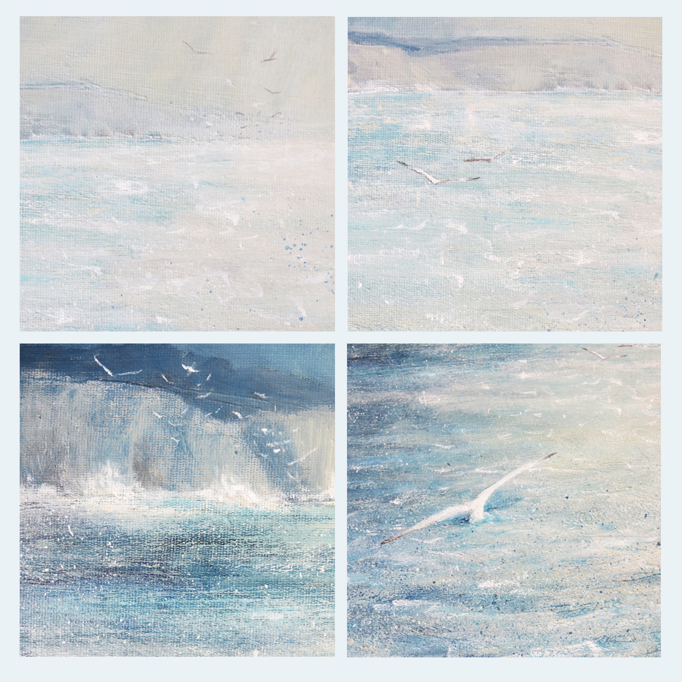
A failed monoprint...a nugget of inspiration - WIP


Study for where the wild things are   monoprint and mixed media 15x15cm   ©2023LisaLeQuelenec


Below a failed monoprint...with potential....I worked back into it with coloured pencils and acrylic paint... a nugget of an idea is forming... I think the scale needs to be bigger...I want to stretch my wings a little...


Gulls and cliff   monoprint  15x15cm   ©2023LisaLeQuelenec


Thursday, 12 January 2023

Limpets and seaglass - watercolour


Limpet and seaglass  WIP watercolour 23x23cm approx  ©2023LisaLeQuelenec


Limpet and seaglass  WIP watercolour 23x23cm approx  ©2023LisaLeQuelenec


I'm not sure whether to continue painting at this point so added real shells and glass in various combinations to see where it might lead and try to nudge a decision.... I think part of the issue I have is that I am so unused to seeing my work on NOT paper as I usually use HOT PRESS and it has thrown me a bit... decisions...decisions....


Limpet and seaglass with real limpet shells and seaglass WIP watercolour 23x23cm approx  ©2023LisaLeQuelenec


Saturday, 1 October 2022

1 Sea Mist - acrylic on linen board


Here is the finished painting....


Sea Mist acrylic 20x20cm   ©LisaLeQuelenec2022


I thought I would try a little video....I hope it worked...


From now until October 31st I will be posting a painting a day that I have made over Spring and Summer. Some have been inspired by a quote from poetry or literature, things that I felt important enough to jot down in notebooks and sketchbooks over the years. For others the quote found me after the painting had been made and just seemed to fit perfectly. Either way I hope you enjoy the series. 


The inspiration for this painting came from a poem by Clinton Scollard called The Mist and the Sea'


'The mist crept in from the sea

Out of the void and the vast;

And bore the silver rain

A shimmering guest in its train...'

                                                                                              Clinton Scollard


The rest of the poem is beautiful, I loved the imagery that it captured and the gentle rhythms of its flow.


This painting is available in my Folksy store.


Wednesday, 12 November 2014

Guiding lights


Guiding Lights acrylic on canvas 50x50cm   ©2014Lisa Le Quelenec


Finally I have finished this painting started in June. It's not quite as dark in real life but I might have a wait to get a better one as more wintery weather seems to have settled in and whilst it is very mild in temperature we are having very heavy rain showers with skies much like in the painting. It feels quite apt to be posting it now.

To see the beginning stages of this painting click here.


Tuesday, 29 July 2014

A storm in a WIP....


Guiding Light (unfinished)  acrylic on canvas 50x50cm   ©2014Lisa Le Quelenec


I didn't appreciate before just how long putting together a blog post takes. There has been painting going on during the past month just not much time to sit at the pooter to edit pictures and get a post together......must try harder.

This is the canvas that I have been battling with. I think I am almost there. I need to live with it a while to 'see' the adjustments that need to be made. I feel that it needs more colour. The reality is not so contrasty and more warmer and subtle in the tones but the camera hasn't picked that up. So the battle continues....


©2014Lisa Le Quelenec


I started by going through my colour notes sketchbook and choosing my palette. I wanted to keep the colour fairly subtle and not too dark. It was important to me that the colours leaned to the warm side, to give the feeling of the hot, humid, heavy feeling before a storm. This palette of ivory black, indanthrene, azure blue, buff titanium and parchment fitted the bill. I have added titanium and zinc white and a touch of pthalo turquoise to the mix.


©2014Lisa Le Quelenec


Blocking in and deciding the tonal patterns are my starting point. Everything is very rough and ready getting the bare bones down quickly. I stayed fairly close to the original watercolour which you can see in my previous post here .


©2014Lisa Le Quelenec


I was starting to work on the shafts of sunlight by dry brushing the paint and added the sail of the yacht in. The painting was trying to tell me that it needed something else. Something subtle but very necessary was missing.


©2014Lisa Le Quelenec

I did what I usually do when faced with such a dilemma. I turned to my sketchbooks. Flicking through I found a tiny sketch of the Isle of Wight and the Needles and decided that the small little detail was just what I needed. I had to keep it subtle though I didn't want anything fighting with the light which is the focal point of the painting.

My sketchbooks are beyond valuable to me and such an important part of the way that I work. Sometimes just for small details like this and the notes about light and atmosphere.


©2014Lisa Le Quelenec


I kept the tones very close so that the land is a mere suggestion. It also appeals to me that the there is a second 'guiding light' with the addition of the lighthouse but that it is outweighed by nature's guiding light.


©2014Lisa Le Quelenec


Reassessing the painting I concluded that the yacht was now too far over to the right of the composition and needed to move to the left a little. I also increased the scale. The sail is acting like an arrow to the sun streaming through the cloud.


Monday, 3 June 2013

Gingko leaves mixed media painting WIP


I began this mixed media painting some time ago and have only just had time to do the finishing layers. Sometimes I find it hard to come back to a piece after a break but I think in this instance it has helped. It has slowly evolved using different materials and techniques and I like the way that the different layers that peek through from each stage meld together in the final image.


Gingko mixed media step by step ©2013Lisa Le Quelenec


Stage 1 - I started with a multi block print of gingko leaves that had been printed on top of a monoprint. My intention from the beginning was to build up a rich patina of texture and colour. The two different processes of print making had given me a good start toward fulfilling this aim. As an image it looks bold, graphic and simplistic.


Stage 2 - After working on top in some coloured pencils and acrylic the image was becoming brighter and bolder. To knock back this strength of colour I added a layer of handmade mulberry paper using acrylic medium to glue it down. The random placing of the threads in the paper added to the texture and the semi opaque qualities of the paper knocked back the colour like a veil of haze.


Stage 3 - In the background of the piece I added watercolour in violets and aqua. Where the acrylic medium that I used to glue down the silk paper was thickest it resisted the watercolour, where it was thinnest the paint settled adding tho the rich tapestry of marks. The leaves were worked into with further layers of acrylic.


Stage 4 - The whole now had a layer of semi opaque buff titanium acrylic glaze from the edges of the silk paper onto the the initial paper ground of the original print.


Stage 5 - I took this same glaze and painted right through the whole image uniting the backgound and image. The leaves were then enhanced with layers of acrylic including the addition of some gold metallic paint to draw out the form of the leaves.


Stage 6 - A final layer of aqua stronger at the bottom and running through the smallest top leaf added some depth to the piece.


Falling   mixed media  15.5x25.5cm   ©2013Lisa Le Quelenec


In the final crop I wanted to show the layers that have gone into making up the painting and so left some of the original paper from the print stage showing. I also chose a double mount to emphasise  the frame within a frame aspect. Whilst it is difficult to show in a photograph, each stage of this mixed media piece has added a rich patina of colour and texture. This painting is for sale at my Etsy shop here.


Ironically I started planning this image from some leaves that I had pressed last year in Autumn whilst now the gingko tree in my garden is in full leaf showing off some beautiful summer colour...

Friday, 11 January 2013

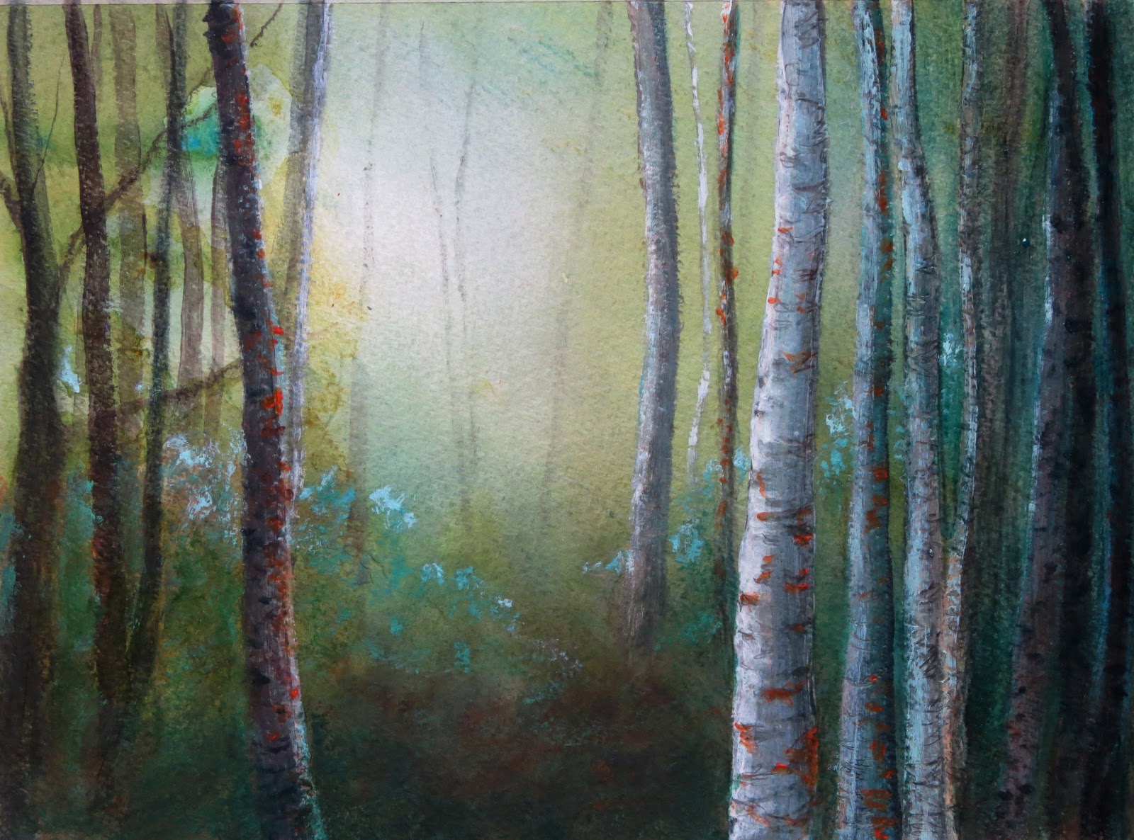
Forest Gloaming complete WIP


(The first three stages of this painting can be seen here)


Forest Gloaming 21x28cm mixed media on paper  ©2013Lisa Le Quelenec


By the end of stage 3 I had a very cold painting. I wanted to bring back some warmth and a little more light into the piece and so scumbled some yellow ochre and zinc white to take the edge off the very blue greens. Neater yellow ochre in the foreground warmed up the forest floor and added to the sparkle of the more purple/blue greens. Overall I have kept the cool atmosphere and the warm ochre has only served to emphasise this. (For some reason when I photograph this painting the warm ochre has been exagerated, it's not quite as obvious looking in the painting and the whole thing is quite a lot lighter. The camera is emphasising a higher contrast than in real life.) Very gently, I have strengthened the trees that stand against the light they are barely there and are suggested with broken line.

Using a NOT watercolour paper has meant that the surface has more of a texture than I would normally use but has been advantageous with some of the media. I've rather enjoyed mixing it up a little and think I will do some more work exploring mixed media.

Wednesday, 2 January 2013

A new year and a new WIP


stage 1
stage 2

Happy New Year!

I hope everyone had a lovely time this holiday season. I've had a lovely break and feel raring to go. 


With no pressing deadlines coming up in January I have decided to take a little time out for experimenting and play. During December and most of November I had so many ideas flitting around my head and not enough time to explore so I'm rather looking forward to this month. January is still so cold and dark and feels decidedly flat after the glitz, sparkle and excitement of December what better way to cheer up the month than to hole up in the studio and play.


In the spirit of experimentation I thought I'd start this years posts by sharing a wip. This piece has been inspired by a walk in the New Forest, I wanted to capture the feeling of walking through the dense trees, their thick canopy overhead, into the bright light of a clearing. The word that kept coming to mind on this particular day was 'gloaming'. Whilst not strictly correct the lack of light in the thick of the forest can often feel like dusk.


Stage 1 - I began with a quick pencil drawing lightly plotting the shapes of the trunks and then adding oil pastel to this which would act as a resist to the watercolour layer that was to come. I scratched back into the oil pastel with a sharp pencil adding in the markings on the birch trunks. The watercolour stage was rather fun, soaking the paper and adding lots of dilute paint, tilting the board and letting gravity have it's way, encouraging back runs. Whilst the paper was still very wet I added some trunks very lightly with the side of a pencil. The extra pressure on the paper was sufficient to give a subtle tone indicating but not over stating the trees presence against the brightest light.


Stage 2 - Building up the trunks with a mixture of coloured pencil and acrylic. I scratched into wet and dry paint enjoying making marks and building up the darker tones, adding in highlights here and there. Then I took stock - the painting felt a little too warm and didn't have the cool and damp feeling that I associate with the forest, I need to shift the colour temperature. Also the left hand side needed more trees to counterbalance the weight on the right.


Stage 3 - More trunks but with less detail on the left, I made these darker in tone to balance the weight on the right. I added light glazes of a phthalo turquoise mix to cool down the temperature which got progressively stronger towards the right away from the light source into the denser trees. With a dry brush and acrylic paint I've added the suggestion of foliage from the forest floor. Finally to contrast against the cool blue greens I've added light touches of cadmium orange (I was feeling reckless, I wouldn't normally use this colour but it felt 'right' in this painting.) I'm leaving this piece here and will return to it next week with fresh eyes.


Stage 3 Forest Gloaming 21x28cm mixed media on paper  ©2013Lisa Le Quelenec


Friday, 13 July 2012

Riding along the shore WIP part 2


Taking a photo and reducing it to black and white is a helpful tool that I use when I'm close to finishing a painting. It helps me to give a last check on the tonal composition. I wanted to make sure that the horse and rider were tonally integrated enough with the rest of the painting. A few colour adjustment glazes later and I was ready to call this painting done.


Comparing the size of the waves on the right to the size of the horse and rider has helped set the sense of scale of the beach. I set the direction of the cloud to help emphasize the depth of field and lead in to the main event of the sun silhouetting the figures.

As you can see from this wip quite a lot of time can pass between initial inspiration and concept to completion of a painting. Sometimes this is due to time constraints and the natural order of things as painting ideas pile up waiting to be explored. Often it's because, for me, time needs to pass before the idea becomes fully formed. The little will-o-the-wisp of an idea will fleetingly tease my memory for a while before fully exposing itself and developing into a fully fledged painting. My sketchbooks are invaluable tools for me to be able to work in this way.


Riding along the shore acrylic on board 20x50cm ©2012 Lisa Le Quelenec


Monday, 9 July 2012

Riding along the shore WIP part 1


I selected a piece of board 20x50cm for this painting, not too big and not too small, the ratio feels 'right' for the sense of space that I want to portray. (There is no reason in particular for this size it just feels instinctively right and is proportionate to some of the preparation sketches that I had done.)

I began the under painting on a warm neutral ground and very loosely blocked in the main shapes of sky, sea and sand. The second stage in this painting was about setting my darkest tone in. I did this early on using ivory black in the dark masses of the water. I knew I wouldn't end up seeing the black after the layers of blue were painted on top  but they would quickly give the depth of the shadow that I wanted in this area.

Now the darks were in place I could easily judge how light the lights needed to be. More often I paint the other way around and put my lighter ranges in first but the painting was willing me to work in reverse. I thought I would go with it and let the painting dictate the way it wanted to be painted.

By the end of stage 3 you can see pretty much all of the black has been painted over. (As a side note ivory black mixed with buff titanium is a very useful colour for sand shadow in evening light. - you can see my old fear of tube black has pretty much disappeared over the last year. ;o) ) As usual I have used a number of blues; coeruleum, cobalt, ultramarine (a blue that I very rarely use) and indigo.


Saturday, 7 July 2012

Riding along the shore - sketchbook preparation for a painting


I thought I'd share a work in progress as it has been a while since the last one. In the past I have shown a stage by stage progression of the actual painting starting with the under painting and working my way through to the final stage. This time I thought I would show the progression from initial concept.

This piece started back at Christmas, on Boxing Day to be exact, with a walk on the beach at St. Aubin's Bay in Jersey. When I was a child we lived very close but in the last twenty years it has become almost unrecogniseable when you look toward the town side as much land has been reclaimed from the sea and the harbor extended.

The photograph makes it look like a really dull and grey day but it was a beautiful morning and warm, it didn't feel like December. The bright sun reflected in the wet sand has over exposed the photo making it look very dark in comparison to how it was. There was hardly anyone on the beach at all, it felt like His Nibbs and I had the whole bay to ourselves. As we walked halfway around the bay a rider was exercising her horse at the waters edge and the reflections they made in the wet sand were catching my eye. On a large expanse of beach even a large horse can look miniscule.  I took some photos and watched intently trying to memorise what I was seeing as I had come out without a sketchbook.....


Sketchbook studies ©2012 Lisa Le Quelenec


It was the sense of scale in particular that I wanted to explore and after sketching square format compositions I thought I would try out a couple of panoramic shapes. It was this format that I decided to focus my attentions on.

You can see that very early on in these planning stages that I have decided to leave out any reference to the actual place. I could have included the shapes of the land or St. Aubin's Fort in the right of the bay or Elizabeth Castle on the right. The reason for this is that by omitting it the painting becomes at once more universal, it could be any beach and the rider could be anyone. I hope for the viewer to be able to put themselves in my paintings with their own memories and experiences.

I practiced getting the shape of the horse and rider, who I planned on showing only in silhouette, first in pencil, paying particular attention to the negative shapes made by the horses legs. (The photographs that I had taken came in very handy here.) Once I felt a little more confident I tried just drawing them with a brush in as few strokes as possible and to the scale that I would need in the painting.

The collage of images above is made from tiny sketches that were originally just a few inches big. Each time a new thumbnail is drawn, the plan for the painting develops, sometimes there are blind alleys but on the whole it is a very useful process for me in developing the essence of a piece. Better to adjust an element in a small thumbnail than to have to adjust something crucial in a large canvas. With preparation done it is time to get on with the painting....

Monday, 16 January 2012

Warm breeze on a winters day - WIP part 3

Warm Breeze on a Winter's Day
50x50cm acrylic on canvas
©2012 Lisa Le Quelenec

There might be a bit more tweaking to do but I think this painting is now finished. As I type this post the sun is starting to set and the beginnings of an apricot orange sky are starting to show. We have been blessed in Dorset recently with beautiful clear skies and warm golden light toward the end of the day. Friday afternoon at the beach was particularly good, surprisingly warm in the sun and clear sea.

I've warmed up the painting with layers of Liquitex vivid red orange in a scumbled glaze which I also added to the to the water at the shoreline. The sand looks like a very solid block of colour in the photo but the reality is lighter and more varied in colour. The violet/grey neutral of the clouds has been scumble glazed with the orange and the two colours vibrate off each other and glow.

The aim of this painting was to give a warm, positive and uplifting feeling. Have I achieved this? What do you think?


* I think I remember where I had read the Van Gogh quote now, 'Colour - A workshop for artists and designers' by David Hornung... interesting book.

Thursday, 12 January 2012

A warm breeze on a winter's day - WIP part 2


Stage 2 - blocking in the cloud
shapes and building up the tones


It's all been happening here... glazing, brushing on and wiping off, dry brush/scumbling. There is lots of broken colour, minute touches here and there of pure colour but for the most part subtle mixes which some might call mud. I can't remember for the life of me where I picked this quote up from, it may be from someone elses' blog or it may be one of the books I've been dipping in and out of but I wrote it down and it's been repeating in my head the last few days;


                            'And how important it is to know how to mix on the palette those colours

                             which have no name and yet are the real foundation of everything.'   
                            
                                                                                                                                          -Van Gogh


Stage 3 - building up the sea
It's the muddy neutrals that make the pure colour sing and I confess they can be the most interesting colours to mix for me.... mud with a hint of...


So here I am at stage 3 needing some more work in the sky, some tightening up in the cloud shapes and colours and working up the waters edge. This piece is on a 50x50cm canvas and I'm enjoying this larger format. Larger scale paintings are what I hope to focus on this year. I've a metre square canvas taunting me and lots of ideas of what to do with it... decisions..decisions...

Tuesday, 10 January 2012

A warm breeze on a winter's day - WIP part1


After the horrible start to the year that my family have had I've decided to start again.... So Happy New Year everyone! Thank you all for your kind wishes for my Dad, you cheered us up no end.

Today has been a much better beginning. A new painting started, with what I hope to be an uplifting feel of peaceful, warm light.

One of my aims with this painting is to widen my palette choice. I'm trying out some new mixes using indanthrene with naphthol crimson, touches of vivid red orange and cadmium lemon as well as my usual azure blue and buff titanium. These hot colours feel a bit brave but a welcome feature on the palette whilst it's so grey outside.

Thursday, 1 December 2011

Light across the bay


Light Across the Bay
acrylic on paper 25x25cm
©2011 Lisa Le Quelenec


Stage 2
stage 1
Stage 1&2, blocking in the basic colours using buff titanium, azure blue and indanthrene.  This painting is on HOT PRESS 300lb Arches, my favourite watercolour paper. Then using a lot of dry brushing I built up the tones I needed to give shape to the waves in the bottom section. I made the horizon especially dark using indigo mixes knowing that this would become much lighter at a later stage as more layers were added. I wanted to have tiny, subtle touches of dark in this area that would blend into the haze.

Stage 4
Stage 3
At stage 3 I could add in the silhouette of Old Harry Rocks and the delicious bright light that underlined it. Once dry I added more dry brushing to soften and lighten the dark at the horizon. I used thick blots of paint to suggest the sparkles, a lot of them were pure colour and unmixed titanium white. Touches of phthalo blue were also introduced at this stage. It doesn't really show up in the photo but I lightened the bottom wave shape with patches of the darker blue still showing through but in much smaller amounts.


Stage 4 and more dry brushing and glazing over the the whole of the water adding back some warmth. I am happy with the patina of the surface that is building up now. All the layers gel together each one partially hidden from the next but with dots and dashes showing through for a shimmering surface of colour.  A new wave shape had suggested itself and was painted in, the shadow of both of these two waves was added with glazes of indigo and phthalo. A very pale dilution of the wave glaze was used in the top of the sky.


Finally another layer of a predominantly azure mix over the water to inject a bit more colour and warmth, some dark added into the bottom wave and a few highlights..... and I'm going to call it finished. I think there will be a bit of a crop to take out a little of the sky when it comes to framing, but I won't think about that until I've gotten some distance from it.


I mentioned earlier about the patina of the surface that built up with the layers of paint. This is an aspect that is very important to me in my acrylics. As I started with a completely smooth surface for this painting, the texture that you see is just made from paint giving me more control. Had I used a paper with tooth it would look completely different and more uniform, this is something that I can find quite constricting. I've tried to get a photo of the textural qualities of  the painting - it was hard to get a close up with my camera. ( my camera skills still need improvement - the painting has a straight horizon too ;o) ) In contrast the sky area is completely smooth where it had been built up with glaze.


So this is what I have been up to over the past week or so, the short days we have now make for much shorter painting time. I've never been very good at painting by electric light despite using daylight bulbs. It does mean more drawing is back on the schedule though which is my silver lining.