Showing posts with label experimenting. Show all posts

Wednesday, 25 June 2025

Ran, nets and print experiements...


I have been having much fun experimenting with different types of netting and getting very inky whilst printing them....


Example no.1 fruit bag netting from the supermarket ©2025LisaLeQuelenec


First up, example no.1 fruit netting from the supermarket - very fine nylon, easy to rip and manipulate although does sometimes spring back unless very stretched out first. In some examples the ink collects at the join and prints spots of ink within the diamond shapes. This type of net gives very uniform shapes.


Example no.3 net from the haberdashery shop used for dance skirt petticoats   ©2025LisaLeQuelenec


Example no.2 is the type of netting that I think would be used to make the big petticoats in some dance costumes - we have a big dance school in the area so I think this is a safe guess. The sparkle glitter bit did break off whilst ripping and manipulating the material but didn't really effect the result in the ink. As you can see it has a much bolder line to the main body and I really like the edges where I have ripped and stretched it. With a bit more experimenting I think more subtle effects could be have by controlling the amount of ink added.


Example No. 3 a thick weave hessian ©2025LisaLeQuelenec


Example no.3 Hessian made even bolder marks and the bonus of this material is where you can pull threads out completely from the weave. I like the effect where it starts to completely fall apart and is literally holding itself together by a thread or two. This one was the 'thirstiest' material and held a lot of ink. More subtle marks were made by not re-inking between prints which is something for me to remember.


Example no.4 Scrim ©2025LisaLeQuelenec


Example no.4 Scrim is another fabric that can be manipulated easily, have thread ripped out from the weave and generally stands up to a lot of abuse. The weave is much tighter and the resulting print can be much more subtle and dense. I think it needs a lot of threads pulling for a net like structure but I like the resulting print.


Whilst running example through the press on top of misprints and practise prints I used copier paper to protect the press blankets. This has given me lots of sheets with reverse prints that I can use as sketch paper for drawing into. I might make a sketchbook from them at a later date.


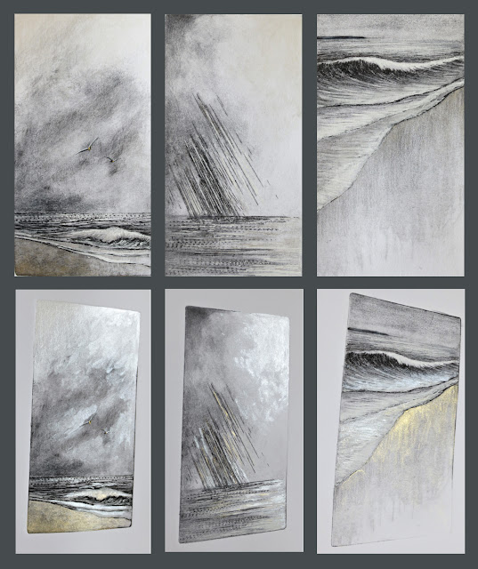
Sketchbook Experiment Stage 1 collagraph and mixed media ©2025


Sketchbook Experiment Stage 2 collagraph and mixed media overprinted with hessian netting ©2025


Sketchbook Experiment Stage 3 collagraph and mixed media overprinted with netting and further added mixed media©2025


Lots more experimenting to do, ideas are starting to form about where these experiments can take me in my Ran project.


Thursday, 20 March 2025

Ran's Daughters - Bara, Unnor & Dufa


Bara - first experiment   mixed media   ©2025LisaLeQuelenec


The tempo is quickening....the breeze grows in strength....something is brewing.


Unnor  first experiment    mixed media   ©2025LisaLeQuelenec


Dufa   first experiment    mixed media   ©2025LisaLeQuelenec


A stronger current, colder, deeper waters, a more insistent tug to the depths.


textures and colour mixing on my ink palette   ©2025LisaLeQuelenec


Wednesday, 5 March 2025

Ran's Daughters - Himinglæva, Kólga & Hrönn


Himinglæva - colour inspiration and first experiement    mixed media   ©2025LisaLeQuelenec


Colour inspiration for mixing ink   ©2025LisaLeQuelenec


Kólga - first experiment   mixed media   ©2025LisaLeQuelenec


Colour inspiration   ©2025LisaLeQuelenec


Ink mix and Hrönn first experiment   mixed media ©2025LisaLeQuelenec


So far these ladies have been a little playful but I think we are about to see a sea change....

Wednesday, 26 February 2025

Ran's Daughters - Blóðughadda first steps and experiments


Colour inspiration - ©2025LisaLeQuelenec


Daughter no.1 Blóðughadda ;


Mixing ink and applying with a palette knife   ©2025LisaLeQuelenec


I began with mixing my inks using quite a bit of extender to aid transparency. To apply the ink to the lino block I used a palette knife varying the thickness of ink and intuitively laying down the colour. Whilst the initial image is starting as a lino print my intention is to layer different materials and techniques to result in a mixed media series. The print process will achieve a variation in textures that will enhance further layers.


The first six prints showing variations in ink application ©2025LisaLeQuelenec


You can see from the first six prints the variations in colour and tone. There is also good variations in texture between very fine flat ink and thicker raised areas and bare paper, this will make interesting surfaces to work with other materials.


I printed a few more variations, my intention is to make some art books (a page for each daughter) and it feels right that there will be nine - maybe with Ran linking each page, or possibly to present each of the daughters mounted as one image. I am sure I will disappear down a few rabbit holes along the way. It feels good to be working on a big long term project. 


I have started using one print and drew into it with coloured pencils, pencils and ink. I am still feeling my way a bit. A minutes sunshine drew some lovely shadows across the page.


Colour inspiration - ©2025LisaLeQuelenec


Experiment I - Ran's Daughters - Blóðughadda   mixed media   ©2025LisaLeQuelenec


Thursday, 8 February 2024

Lokta - media experiments on new to me paper and gathering resources


Top right - experiments with different media on handmade Lokta paper
Top left - initial ideas for a range of colours for the project
Bottom - experiments with lino ink and carved stamps
©2024LisaLeQuelenec


Gathering thoughts and experiments to continue with the pebble project.....


Experiments with different media on handmade Lokta paper  ©2024LisaLeQuelenec


I bought some Lokta paper, it is A4 and a beautiful creamy colour, some with speckles. It is  thin, strong and fibrous and one side is slightly smoother than the other. I did the same experiments on both surfaces but the difference in results was negligible. Wetting the paper and tearing gives a lovely 'fluffy' edge (like most thin handmade papers) and it cuts well with knife and scissors - these are characteristics that I want to utilise in the coming works.


My next experiments were using lino printing ink in both bold colours, neutrals and off whites.


lino print experiment on Lokta paper ©2024LisaLeQuelenec


lino print experiment on Lokta paper ©2024LisaLeQuelenec


lino print experiment on Lokta paper ©2024LisaLeQuelenec


The results are subtle, I had to photograph these with a dark paper behind to show the contrast as the camera struggles to pick up the pale tones. I rather like the effect though and will definitely be exploring very pale compositions at some point - maybe more as drawings....


Print, collage, acrylic ink and pencil on Lokta paper...about A6ish   ©2024LisaLeQuelenec


Exploring shape, line and rhythm. There is something very calming about drawing flowing lines. I'm making connections in my mind with Japanese gravel gardens, Wilhelmina Barns-Graham drawings and ripples on still water. I feel like I am edging towards something...maybe I am flowing too?


Sand ripples left by the tide   ©2024LisaLeQuelenec


Aren't these ripples divine? The tide was fast and strong to leave these behind, they are quite large and deep.


A Falling Tide   ©2024LisaLeQuelenec


The shot below was taken through the lens of my sunglasses - I like the dramatic tonal contrast.


Sand ripples through my sunglasses   ©2024LisaLeQuelenec


All these sources will no doubt filter into this next body of work, I'm enjoying the process of collating and curating.


Thursday, 18 January 2024

Inspiration from unusual places...


Rag rug watercolour thumbnail sketch  ©2024LisaLeQuelenec


Rag rug ©2024LisaLeQuelenec


It started on a sunny day, I noticed the denim rag rug and the way the light had faded areas - the patterns made by light and shade, the tones, the colours and textures... a little noticing.


Sketchbook studies - rag rug    watercolour   ©2024LisaLeQuelenec

I grabbed my sketchbook and sketched out some thumbnails.....which led to some collages.....


Collage WIP    ©2024LisaLeQuelenec


Rag rug studies   collage with shells   ©2024LisaLeQuelenec


That were strangely addictive to make.....  to be continued......


Thursday, 16 June 2022

Lines in the Water II & III - linoprints


Lines in the Water II   linoprint 15x15cm   ©2022LisaLeQuelenec


Two more in the series, once again varied, open editions. I will have fun exploring and experimenting with different inking techniques and colourways. 

Prints available in my Folksy Store.


Lines in the Water III   linoprint 15x15cm   ©2022LisaLeQuelenec


A big thank you to the lovely anonymous buyer of journals, RedBubble doesn't tell me who you are but I think I know....thank you Kentucky I hope you  love them ;o)

Thursday, 26 May 2022

Lines in the water - linoprint


Lines in the Water I   linoprint 10x15cm  ©2022LisaLeQuelenec


So the last few days I have begun printing the lino plate from my previous post. I tried out a couple of colour ways and also over printing on to a pre-printed background. 


Lines in the Water I   linoprint 10x15cm  ©2022LisaLeQuelenec


Lines in the Water I   variations linoprints 10x15cm   ©2022LisaLeQuelenec


It was whilst I was inking up the plate in the top image colourway that I thought....hold on I have been here before....March 2018 (handy that I have been blogging for so long as it meant I could go back to check when)....a predecessor methinks..... How did I not make that connection? I am coming to realise that my working practise is circular or maybe that should be tidal? Themes wax and wane like the moon's pull on the ocean. I don't feel like I am reworking old ground though...rather eroding away at ideas until I reach (maybe one day if I am lucky) the essence of the thing. Back to mulling over ideas as to where this is going...time for a walk.


Elemental I, II & III   each image 11x18cm   ©2018LisaLeQuelenec


Thursday, 19 May 2022

Lines in the water - doodles and linoprinting


Telephone doodles   ©2022LisaLeQuelenec


I've had reason to be waiting on hold with telephone music to keep me company lately. Totally mind numbing. However with my mind numbed and without thinking my hand set to work doodling, it had quite a bit of time fortunately/unfortunately. Once said call had ended and my brain slowly worked its way out of the fog I looked at what my hand had done. I'm not sure if it is something or nothing but thought I would spend a little bit of time exploring the drawings, redrawing, pondering - I like the flow and movement of the lines and the variations of weight and depth. 


The lines are making me think of Wilhelmina Barns-Graham's drawings and some Victor Pasmore paintings. What do you think?


Linoprinting has always been a challenge and was something I actively avoided in my college days (many, many years ago). However these line doodles feel like they might work best in this medium so I am having myself an experiment. Now lino has come along since I last had a go and there are much easier materials to carve these days. No more the tough as nails brown, heavy stuff that I used to lay over a hot water bottle in the vain attempt to help soften it, no now there is this marvellous blue Japanese vinyl. With a reasonably sharp tool it cuts like butter, which is a good job as my hands would definitely not be up to carving the old style lino.


So after refining one of my Phone doodles I traced the drawing onto the vinyl and carved away. Time was not on my side so instead of getting out the printing ink and because I was far to impatient to wait for another day I tried out an ink stamp pad to try making a quick proof print from.


Playing with lino ©2022LisaLeQuelenec


There is quite a bit of 'noise' - bits of lino that I haven't quite carved enough away and have printed where they shouldn't. I'm not sure whether to leave some or not as I think it will help the image not look quite so graphic and maybe a bit more like water. Also in my impatient proofing I did crumple the paper which left a couple of creases oops! I will ponder some more before getting the printing ink out another day and playing with different combinations of inking. It feels rather exciting to be trying something completely different again and I am wondering how this will feed into my other work it normally does at some stage without me realising it at the time.


Thursday, 17 February 2022

Drypoints and mixed media experiments...


Sea Air, A bit of Weather and Bracing!   8x15cm drypoint with mixed media   ©2022LisaLeQuelenec


I treated myself to some new paint last week... Gansai Tambi watercolours - Starry colours made by Kuretake. Oooohhhh they are lovely, I particularly like the paler colours which are shimmery but not opaque. I have used pearlescent inks before but have been disappointed with the outcome. These watercolours are much better for the effect that I was after.


Using test prints from the previous drypoint I have added shimmer in certain areas whilst leaving others with just the original ink. I have photographed them above straight on and to angle so you can see how they catch the light. I think it would be easy to overwork a piece with the shimmer and I may need to rein in my enthusiasm but I can definitely see possibilities.... What do you think?


These and prints from the edition are available in my Folksy store.


Thursday, 3 October 2019

Arriving storm - drypoint with collagraph


We have had some spectacular weather the past week or so...lashing rain, howling wind, there have also been some breathtakingly beautiful sunsets. I love Autumn and all its changeability, I am looking forward to seeing the changing colours. It won't be long now I think.

The storms have been quite something and have been prompting some new work.

Storm at Sea   14x14cm drypoint with collagraph monoprint   ©2019LisaLe Quelenec

A mixture of techniques have been used to make this print - there are areas of drypoint and collagraph and due to the disintegration of the plate in the sky area each time it travelled through the press, each print has altered and arrives at the other side appearing quite different. I like the idea of the plate physically eroding like the coastline it is depicting in the storm.

This print is available at Seaside Studios UK.

Wednesday, 25 September 2019

Cloud monoprints and mixed media - an experiment with technique


In the clouds   foil covered plate on the left and monoprint with mixed media on the right 12x12cm   ©2019LisaLeQuelenec


Finally the ink was dry enough to take some photos and move onto the next stage..... Above are some results of a fun mornings experiment. I was short on time and needed to be inventive as I had run out of acrylic medium. I had had an idea and was desperate to get something down on paper but without the medium to seal a plate I needed a work around in my approach.

I had read a while back about a technique called foliography where by you lay down leaves, grasses and organic matter onto a plate and cover in tin foil before inking up and running through the press. I think the idea is that the foil adds strength to the delicacies of the plate and by not varnishing it you aren't adding any accidental brush marks that could detract from subtle veining etc in the plant matter. I wondered if this idea would work for me and thought I would give it a go.

Using a 12x12cm piece of greyboard I 'drew' a quick design with a hot glue gun. The glue dries very quickly and so I could quickly move to the next stage of covering the whole plate with some tin foil. (The one I had was quite a thick one, I think the thin stuff would tear a bit too easily.) Carefully as I wrapped the foil onto the design I was burnishing it into the recesses of the plate and smoothing out any little wrinkles that could hold ink where I didn't want them.


Glue gun design on mountboard (detail) ©LisaLeQuelenec


On the left is a close up detail of another plate I have waiting in the wings to be experimented with.  This one is on a scrap of mountboard so you can compare, I hope, the  difference in depth between the board and the glue. The plate I used for this experiment had some areas that were very thick like this one.


Then I inked up the plate with a brush and wiped with a rag, taking out highlights and sometimes adding a bit more ink here and there. Now to run it through the press (using dampened paper) .... It worked pretty well and I managed to get 5 prints before the glue started to move around and tin foil began to wrinkle under the pressure of the press.

So not a great technique if you wanted to make an edition but for very small sets or for monoprinting and generating ideas I think it has its merits. Speed of plate making being the most useful - I can see with a bit more playing how this could be useful to do in a workshop situation when you are always working against the clock.

One of the things I particularly liked about using the glue gun to make the image was the variety of mark that could be made manipulating the glue and the very deep emboss that could be achieved. This is definitely something that I will utilise again. I wish I had had the forethought to make an impression without any ink at the start - I have made a mental note for next time.


In the clouds   monoprint and mixed media 12x12cm   ©2019LisaLeQuelenec


The ink on the prints took the usual ten days to dry so I impatiently waited to work back into them with colour pencil. After seeing the depth of the emboss I knew this was something I wouldn't be able to resist. It also meant that I could carry on experimenting and exaggerating the tonal and colour differences that began in the inking process. I now have more ideas to develop at a later date maybe in print or paint - I will let them percolate a while before deciding.

We have had some spectacular rainstorms the last couple of days and are forecast the same for the rest of the week. I was caught out yesterday walking the dog in rain so heavy that I couldn't see for a few minutes. It was really quite extreme. Watching the build up of cloud and the changing light before hand was quite dramatic as were the flooded roads on the way home. The rest of the day was pretty much blue skies and sunshine. more clouds to ponder....


Thursday, 31 January 2019

Stripes from the Shoreline - every day in February 2019


The latest treasures collected from the shore ©2018LisaLeQuelenec


The inspiration for a project has come from a tiny page in a sketchbook that I shared in August 2017 (Time really does fly, I couldn't believe how long it had been when I checked back.) 


Stripes from the shore sketchbook page ©2017LisaLeQuelenec


The notes and small sketches on the A6 pages keep coming to mind as I walk along the beach and notice more and more ‘stripes’ not only in the little treasures that I pick up along the way but also in the actual beachscape itself. From bands of cloud, the bands of waves as they travel to shore and also in the groynes that protect the space from erosion. The more I notice, the more I feel that I need to make some work exploring these patterns. Not only the horizontals but also importantly the verticals that I find in the landscape. 


Stripes from the shoreline   ©2019LisaLeQuelenec


When I look back at my work over the last couple of years, I feel that I can see this motif emerging subconsciously more and more. Now I feel that it is time to recognise it more fully – to name it so to speak. I also have a hankering for making some work in a more abstract kind of manner. I have no sense of how these ideas could develop and feel open to possibilities so I have decided to make a mini project for the month of February a small collage a day to try out and maybe consolidate some ideas.

 
The 'palette'  ©2019LisaLeQuelenec
 
I work better when I have limitations so I have set some boundaries for myself to hopefully achieve a considered approach;
  
Each piece will have a base layer measuring 6.5x6.5cm (2.5x2.5 inch) square.

         Each piece may or may not have elements that break this boundary.   

      The palette will be a range of aqua, grey, white and cream opaque and semi-transparent papers that have been pre-painted or printed.

 Attention will be paid to the weight, balance, tension, edges, tone and texture. 

I may spend no more or less than 30 mins on each piece.   

In the interests of a cohesive body of work each piece will be mounted      onto a white textured backing paper measuring 15x20.5cm (6x8 inch).


I feel quite excited by the project idea. There are so many rabbit holes that I could wander down and the difficulty will be focussing on only one aspect a day. I am hoping to see a progression of ideas that evolve over the four-week period. Intentionally I am going to make an abstract piece as a starting point in the hope that I can brush aside any preconceived ideas – I wonder what will develop…. Tomorrow I will begin.