Showing posts with label techniques. Show all posts

Saturday, 21 October 2017

Gulls 1


Gulls have featured in my work for a number of years now. I discovered a poem by Neruda a while back and some of the imagery in the piece has stayed with me. It has sparked ideas to explore which are turning into a series of works in a variety of media.

I feel like a gull circling in the sky getting closer but not quite hitting the mark just yet. I have started with some monoprints with Neruda's words in my mind. Using an inked plate and removing ink, applying masks and also making marks in the ink before running through the press.


Flying Free   monoprint and mixed media   ©2017LisaLeQuelenec


Some I made ghost prints with (running the plate with ink depleted from the first pass through the press for a second time). I likes the subtleties of a couple and so have left those untouched. Other ghost prints weren't strong enough to stand on their own so I have worked into those with other media. Others have been photocopied, scanned and digitally manipulated and exist only as digital prints. We are fortunate to live in an age where so many opportunities and methods of experimentation are open to us and I like to exploit as many as I can on occasion.I'm not sure where I am going with these still.....I'll see where the breeze takes me.


Gulls   ghost monoprint and mixed media   ©2017Lisa Le Quelenec


A translation of the poem that inspired this work can be read here


Thursday, 28 September 2017

My favourite art books


A while back artist Sherrie York posted about her book collection and it got me to thinking about my favourites, how they had changed over the years and about the ones that I keep referring back to like old friends. Back in 2011 I wrote this post about 10 of my favourite art books. Those are all still 'up there' but there have been quite a few additions especially as I have explored new techniques in printmaking.


Some favourite books  photograph ©2011 LisaLeQuelenec


I have put together a Pinterest board of favourite books  if anyone is interested in having a peek along my bookshelves virtually. Maybe you will find something that would interest you to check out at your local library next time you visit.

Would you like to share your favourite books in the comments? I would be interested in knowing what you recommend after all you can never have too many books ;o)


Wednesday, 20 September 2017

Pine cones - it started with some sketches....


Pine cone sketches   pencil ink and watercolour   ©2017Lisa Le Quelenec


...and quickly got out of hand... but in a good way. I love the structure of pine cones, such a challenge to get 'right'. There is a park I visit with my little one that guarantees we will come home with at least a few we are both as bad as each other with our little collections and we added quite a few more this summer.

Sketches and doodles turned into...


Pine cone stages   watercolour on A4 paper   ©2017Lisa Le Quelenec


There are two paintings available to buy here at Seaside Studios UK.


But then that turned into....


From sketch to drypoint plate to prints   ©2017Lisa LeQuelenec


and now I have these....


Trio   artist proof 1 drypoint print 19x10cm   ©2017LisaLeQuelenec


Trio   artist proof 2 drypoint print image size19x10cm   ©2017LisaLeQuelenec


Trio   3/20 drypoint print image size19x10cm   ©2017LisaLeQuelenec


Trio   drypoint prints image size 19x10cm   ©2017LisaLeQuelenec


Which are also available at Seaside Studios UK and at Seaside Studios Uk on Folksy.


I do get myself in a pickle sometimes :o)

Friday, 8 April 2016

Ammonite spiral solar etching


©2016LisaLeQuelenec seasidestudiosblog.blogspot.com

Ammonite   solar etching   14.5x20.5cm   ©2016Lisa Le Quelenec


This what I had been intending to print when I stumbled across the seahorse plate from the previous post...These prints are from a second solar etching plate that I made on the Printmaking Course at Arts University Bournemouth. (For an explanation of the process visit this post Sea urchin - solar etching.) I had decided to do another ammonite plate to be able to compare and contrast the technique and outcome with a small zinc ammonite plate I had etched in the traditional way. (Variations are shown here.)

After experimenting with the inking up and printing of both types of plate I think the outcomes are hard to distinguish between. Maybe the difference would become apparent when printing large editions with one plate wearing down quicker than another. My research hasn't come up with an answer to that, only that both types of plate are very hard wearing. I have enjoyed both processes and can see the advantage of solar etching for my circumstances in not having to use the acid bath to make plates. Whether I can make it work for me using sunlight and not having to have a light box to expose the drawing onto the plate remains to be seen, more experiments to come over summer methinks.


Ammonite   solar etching   14.5x20.5cm   ©2016Lisa Le Quelenec


Both of the above prints are available in my Etsy store Seasidestudiosuk.


Thursday, 21 January 2016

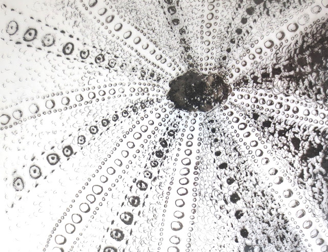
Sea Urchin - solar etching


seasidestudiosblog.blogspot.com
Urchin - A/P1   solar etching   21x15cm   ©2016Lisa Le Quelenec


Having signed up for a second term of printmaking at the Arts University Bournemouth last year I was very excited to learn that we would have the opportunity to try our hand at solar etching. This technique appeals to me as there is no acid involved and so is something safer for me to do at home whilst I have an inquisitive toddler roaming around.

Solar etching uses a light sensitive polymer coated plate to transfer an image from a clear film. The image could be a photograph or drawing photocopied onto acetate or something made directly onto a transparent sheet. I chose to work directly and so onto a piece of plastic I drew with alcohol based drawing pens making a variety of marks and building up the density to get a good variation of tone.


seasidestudiosblog.blogspot.com
Urchin   drawing on acetate   ©2016Lisa Le Quelenec


Once this was complete the plate was first prepared using an 'aquatint' sheet ( a sheet of film that has a very, very fine and even tone, digitally print and so dotted surface). Laying the plate onto this sheet and exposing it in a lightbox meant that I would get a more subtle variation in tones from my plate when I processed my drawing. Next the drawing is placed on the lightbox with the plate on top and exposed. Moving quickly so as not to over expose the plate to too much extra light it was placed in a bath of warm water to wash off the light sensitive coating using a soft brush. (You know that the coating is fully removed when the plate no longer feels slimy to touch.) The final stage in plate preparation is to give the plate a further exposure in the lightbox to 'harden' off. Once this has been done the plate is ready to be inked up and run through the press in the same way a traditional etching plate. The plates are very strong and a fairly large edition can be achieved without loss of image quality.

(The timings of exposure vary from lightbox to lightbox but this process can also be done using direct sunlight but as the strength of light isn't as controlled the results can be harder to predict so I am told.) Roll on summer as I am seeing this process featuring again in my future. I would like to experiment with using different materials to do the drawing with for a wider variety of marks maybe chinagraph pencils, ink/paint applied with brushes.... also using photocopies of paintings and drawings perhaps?


seasidestudiosblog.blogspot.com
Urchin drawing, plate and print ©2016Lisa Le Quelenec


For now I am experimenting with inking up the plate and seeing what I can do with it. Different ways of manipulating the ink on the plate are giving exciting results. The centre print was inked up using a roller as if it was a relief block.


©2016 seasidestudiosblog.blogspot.com
Urchin A/P 2,3&4 solar etching   21x15cm   ©2016Lisa Le Quelenec


Thursday, 15 October 2015

Storm at sea - prints using dry point and collagraph in combination


seasidestudiosblog.blogspot.com
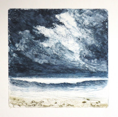
Storm at Sea 2/5  combination print 14x14cm   ©2015Lisa Le Quelenec


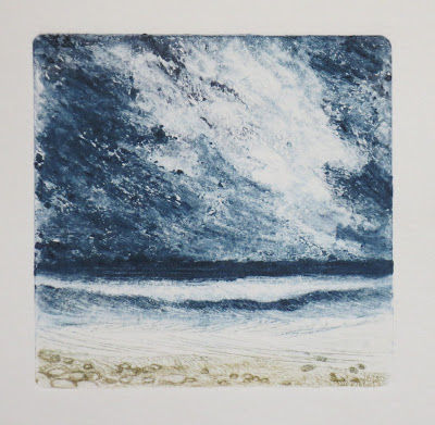
These three prints are part of an experiment to combine two techniques. Using a perspex plate I used the drypoint needle to scratch the sea and the pebbles on the beach. In the sky area I used an acrylic fibers medium to create the stormy clouds. I didn't notice at first as each time I was also trying out a different style of inking up the plate but each time that I inked up for another print a little of the acrylic medium was detaching from the plate and the sky area was slowly disintegrating. In a way each of these is a monoprint as the plate was different for each impression. I really like the idea of the plate changing during the process like the clouds changing during the storm and the storm gradually dissipating - serendipitous printmaking.


seasidestudiosblog.blogspot.com
Storm at Sea 3/5  combination print 14x14cm   ©2015Lisa Le Quelenec


seasidestudiosblog.blogspot.com
Storm at Sea 4/5  combination print 14x14cm   ©2015Lisa Le Quelenec


Wednesday, 1 April 2015

Print making day 2 dry point and etching


A Sudden Shower 1   dry point 10.5x5.5cm   ©2015Lisa Le Quelenec

Toward the end of the previous session we had tried a little dry point as a test piece to get a feel for the technique. Using a small off cut of aluminum we scratched in a design using an etching needle. I know that I have used this process before back in my college days but being twenty years ago now I can barely remember it. I hadn't scratched in hard enough to get a deep enough burr to hold the ink so my first pass through the press was too feint.


A Sudden Shower 2   dry point 10.5x5.5cm   ©2015Lisa Le Quelenec

After going over some of the lines and inking up again I was much more encouraged by the results. Now I just needed to concentrate on the inking up which is I think, the real 'art' of print making; knowing just how much to take off the plate I have found difficult to get the hang of. I think this is something that will come after many, many failed prints.


So a new day and a new set of adventures began. Trying to remember all that I had learnt about the above technique I started a new plate. This is the best print of the course for me. Luck was on my side and some magic happened...


On the Dunes   dry point 10x18.5cm ©2015Lisa Le Quelenec


I used the etching needle to scratch in and cross hatch the fence posts, then carefully drew in the lines of the wire fence and grasses. When I inked up the plate I used a sepia ink only inking on the burr and I didn't apply any to the sky area or the sand on the right. I spent time buffing off the excess and burnishing the foreground grasses. At the last minute I had an 'I wonder what would happen if?...' moment and I used a piece of used black inky scrim and very gently wiped over the areas that had no ink at all on them. (My initial intention had been to leave these areas completely pristine and white.)

Using pre-soaked paper I ran it through the press and was excited to see the result. I like the tonal range of the image. The black inky scrim has given it a very subtle smokiness which I think gives it a nice atmosphere. There wasn't time for me to do a second pass in comparison without the grey so I will have to return to it another time. I think if I had left it completely white the image would have looked to hard and graphic. There are, of course, a lot of things that can be improved on with the drawing and inking of the plate and my edges aren't terribly neat but I felt satisfied that I had made a good start.


The plate 7.5x8cm ©2015Lisa Le Quelenec
On to etching with acid... using a small piece of zinc that had been coated in hard ground I gently scratched in with an etching needle. My shell design was so gently drawn in as to only have taken off the ground rather than denting the plate. I wondered if this would be enough for the acid to bite into. It went into an nitrate acid bath (ratio 1/10) for 25 minutes and was washed and prepared for inking. Again I used sepia ink but the burr in the plate was so subtle that I really didn't have high hopes for getting a decent impression. This is the plate before I had cleaned the ink off so you can see the ink in the lines. If you run your nail over the plate you can barely feel the indentation. I really like the plate as an object in itself - nice shiny zinc with the delicate inked lines  - I am tempted to frame it ;o)


Scallop A/P 1   etching ©2015Lisa Le Quelenec


The first proof taken from the plate. I was pleasantly surprised at how much detail had come out. I had obviously underestimated just how much pressure the plate is put under in the press.


Scallop A/P 2   etching ©2015Lisa Le Quelenec


As an experiment without inking the plate again I ran it through the plate a second time. Not so strong an image but I quite like the faded subtlety of it.


So after busy day two I had much to think about. I really enjoyed the etching process but baths of acid etc aren't going to be very practical for me to replicate at home. Dry point is maybe similar enough for me and very much appeals to my love of drawing. This was something for me to research before the next session.


Monday, 3 June 2013

Gingko leaves mixed media painting WIP


I began this mixed media painting some time ago and have only just had time to do the finishing layers. Sometimes I find it hard to come back to a piece after a break but I think in this instance it has helped. It has slowly evolved using different materials and techniques and I like the way that the different layers that peek through from each stage meld together in the final image.


Gingko mixed media step by step ©2013Lisa Le Quelenec


Stage 1 - I started with a multi block print of gingko leaves that had been printed on top of a monoprint. My intention from the beginning was to build up a rich patina of texture and colour. The two different processes of print making had given me a good start toward fulfilling this aim. As an image it looks bold, graphic and simplistic.


Stage 2 - After working on top in some coloured pencils and acrylic the image was becoming brighter and bolder. To knock back this strength of colour I added a layer of handmade mulberry paper using acrylic medium to glue it down. The random placing of the threads in the paper added to the texture and the semi opaque qualities of the paper knocked back the colour like a veil of haze.


Stage 3 - In the background of the piece I added watercolour in violets and aqua. Where the acrylic medium that I used to glue down the silk paper was thickest it resisted the watercolour, where it was thinnest the paint settled adding tho the rich tapestry of marks. The leaves were worked into with further layers of acrylic.


Stage 4 - The whole now had a layer of semi opaque buff titanium acrylic glaze from the edges of the silk paper onto the the initial paper ground of the original print.


Stage 5 - I took this same glaze and painted right through the whole image uniting the backgound and image. The leaves were then enhanced with layers of acrylic including the addition of some gold metallic paint to draw out the form of the leaves.


Stage 6 - A final layer of aqua stronger at the bottom and running through the smallest top leaf added some depth to the piece.


Falling   mixed media  15.5x25.5cm   ©2013Lisa Le Quelenec


In the final crop I wanted to show the layers that have gone into making up the painting and so left some of the original paper from the print stage showing. I also chose a double mount to emphasise  the frame within a frame aspect. Whilst it is difficult to show in a photograph, each stage of this mixed media piece has added a rich patina of colour and texture. This painting is for sale at my Etsy shop here.


Ironically I started planning this image from some leaves that I had pressed last year in Autumn whilst now the gingko tree in my garden is in full leaf showing off some beautiful summer colour...

Thursday, 14 February 2013

Dip pens


Dip pens and acrylic ink


Today's post is in answer to Theresa Evans' question about the type of pen I used for yesterday's daffodil study. The one I mostly use is the green glass handled one that I picked up on a trip to Venice a few years back. The nib is really flexible and I am dreading the day that it gives up as after searching online it seems like it would be hard to find a replacement. It's had a lot of use and is a firm favourite. The twisted handle is surprisingly comfortable to hold as well as looking rather lovely in the pen pot. ;o)

The other pen in the picture is made from bamboo and I've had it so long that for the life of me I cannot remember where I got it. I know I got it for use in life drawing classes after failing miserably to cut me own. (maybe I should give it another go...)  The marks that it makes are a bold contrast to the other pen and as it doesn't hold much ink inbetween 'dips' there is a lovely variation in the ink even in one stroke.

My preferred ink is FW acrylic in sepia which I generally use very diluted reserving neat ink for only the odd mark within a drawing where a bit of punch is needed. The soft tone of the dilute ink lends itself to subtle washes of watercolour to my eye.

Pop over to Theresa's  blog and see her beautiful work, the light that she captured in her last watercolour 'Winter Sunset' is gorgeous.

Tuesday, 3 April 2012

Contrails collograph experimenting without a press


Sketchbook pages for contrails
mixed media ©2012 Lisa Le Quelenec


Continuing experiments with the contrails and sunsets in my sketchbook toning down colour and trying a small watercolour version led me to thinking about collograph printing. I've only ever done it a few times at college many years ago and assumed that without a press I wouldn't be able to do it again. However some time back on Jeanette Jobson's blog - Illustrated Life she wrote about collograph printing without a press. She inspired me to give it a go.


For those that don't know collograph printing is a form of relief printing where the plate is made of collaged textures. All sorts of different things can be used. I've seen bits of fabric, string, spaghetti, cardboard, corrugated paper, and grit all used with great success. Not having a press at my disposal, I
thought I'd better not use anything with too much texture as I wouldn't be able to apply enough pressure for a successful print by hand.

The plate all ready to be printed
To begin with I cut a square of ordinary mount board. I used the back as it was a smoother surface. Then I drew out the design. Mount board is made of thin layers and by scoring into it I could peel back some of the layers to reveal a fluffier paper fibre surface. I did this all around the outside of the plate to make a border and also to the lowest contrail shape. Very carefully I cut a circle for the sun with a scalpel going right through the board. I envisioned the prints needing some hand finishing and so would paint in this colour later. For a couple of the contrails I used an acrylic medium made by Liquitex called Blended Fibres. I painted this on not letting the relief area stick out more than about 3mm. The linear element of the design was embossed using ball point pen. The final stage in preparing the plate was to give the whole thing a coat of acrylic medium to seal it.


collograph plate


To give myself a fighting chance of getting a good print I thought I would use watercolour and watersoluble crayons to 'ink' the plate. I thought by using them and printing onto damp paper I wouldn't need half as much pressure than if I used printing ink which is much stiffer. The crayons I used were a mixture of Caran d'Ache Neocolor II and Derwent Aquatone and they adhered to the plate really well. The watercolour balled up on the surface which I expected but I was hoping when I printed that the pigment would bloom onto the damp paper. Here's the plate all ready to print.


collograph print
After soaking some watercolour paper (Arches 90lbs Hot Press) for a couple of minutes I was ready to go. (The paper was wet all the way through but dry enough to not have a sheen on the surface.) Laying the plate on one drawing board and covering it with the wet paper I put another drawing board on top. Then I stood on top of this sandwich moving around to try and get even pressure all over and kept my fingers crossed. Carefully taking off the top board and holding down one side of the paper so that it wouldn't move out of position I took a peek. It has mostly worked except for one small area so I put the paper back down and pressed by hand in this little spot until all the paint had adhered. To 'fake' a plate mark, which it would have had if it had gone through a press, I ran the back of my nail along the edge of the plate until it had embossed the paper. It's heavy work on the hands but looks better for it. The print didn't photograph well at this stage, the colours were more intense than they show here. I printed 3 more from the plate, two I did with NOT watercolour paper (the surface interferes with the texture a little too much when pressing by hand.).


Once the prints were dry I worked back into them with coloured pencil and acrylic ink. I even used some gold acrylic to wash over and pick out some areas. Below is the finished piece. I'm not sure what to call this so if any print makers could let me know I'd be grateful. Is it fair to call it a hand finished collograph or would it be better to call it a mixed media with collograph. I'd like to make a series of these and it would be handy to know.


Heat Have I - print I/IV
Hand finished collograph 17x17cm
©2012 Lisa Le Quelenec


The eagle eyed amongst you will have noted that the image is 'back to front' from the original drawing. I thought it would be good to add this to the experiment and see how the change would affect the composition. I think the composition does still work and I also like that not all the contrails have come out. The composition feels much more circular now and much less cluttered. I enjoy the surprises thrown up by changing mediums and processes, I wouldn't have ever gotten a result like this if I had stuck to painting.

It was a fun day experimenting in this way as I was totally unsure of the outcome or even if there would be an outcome. The whole process is magical and full of discovery for me and I will definitely be doing some more.

Monday, 19 September 2011

Continuing to explore tube grey in watercolour

Getting to know W&N neutral tint on Arches NOT 140lb

A very kind and generous friend, after seeing my last post, has sent me a tube of Winsor & Newton neutral tint to experiment with along with some different paper to test it out on. (Thank you so much!) You can see the first experiments, getting to know the new pigment above. A few of these will, I think, develop into paintings over time.

The repetition of painting variations of the same theme in very quick succession seems to work really well for me in generating ideas. The act of painting becomes much more intuitive and whilst the results of the sketches couldn't be considered finished pieces they do hold little gems that can be developed into further work. (I find mono printing is another lovely technique for this).


My conclusions so far;

* All the paints were much easier to lift out, either with a dry brush or tissue on Arches watercolour paper than the Khadi which is much more absorbent. I think this is due to the differences in the sizing and materials used to make the paper. The Khadi paper is much more fibrous and 'woolly' - characteristics that could be used to advantage with different techniques.

* W&N neutral tint hasn't granulated in any of my experiments, the Daler version did so easily with some very beautiful results as did their ivory black. This will be due to the different pigments used to make the colours. Using these colours in paintings I would consider all the characteristics, possibly using non-granulating W&N neutral tint for skies and Daler neutral tint for granulating textures in the sea.

* W&N neutral tint veers toward purple and the Daler version to a more pinky colour to my eye.

* I would describe ivory black as a warm, soft willow charcoal grey and lamp black as a harder compressed charcoal black. (- hope that makes sense...) I think I would gravitate toward the softness of ivory black for tonal sketching.


from left to right; W&N neutral tint, Daler neutral tint, Daler ivory black, Daler lamp black, Daler sepia W&N Payne's grey (In the test pieces above I painted around the moon rather than lifting the paint out.)

This little dalliance on the dark side has been interesting and is something I will continue to explore. However, with exhibitions fast approaching and deadlines all seeming to come together, as they do, experimenting like this will have to take a back seat for a little while. There will be more posts coming in the future though.

Monday, 12 September 2011

In praise of breaking the rules

This post has been inspired by a comment left in my last post. It's quite long but hopefully not too rambling....


'A tangent always leads somewhere... beyond the known and comfortable! Isn't that what making art is all about... ?... Exploring and growing!   - Bruce Sherman

Bruce I couldn't agree more...


For years I didn't used black paint, after all so much better to mix complimentary colours to get harmonising greys in a painting. ....and black in watercolour...perish the thought! Then a very kind person gave me some paint. Nestling in a box of tube pigments were two tubes, Payne's grey and ivory black. I would pass by these two tubes always reaching for the other colours and staunchly ignoring them.

One day my curiosity got the better of me and I took out the Payne's grey. I think as much as anything the name had put me off as I equated it with 'dull' and 'boring'. What a wonderful surprise awaited..... hold the front page.... Payne's grey is actually a wonderful blue! I took a while to experiment and get better acquainted.


For a long time ivory black was still ignored like the wicked witch in a fairytale. Then one of those days when you want/need to paint but don't have anything in mind arrived. I was just about to pass by that little tube of ivory black once more when I thought hold on I'm a grown up now I may have always been taught never to use black in watercolour but since when did I always listen to the rules? Don't the best break throughs come from always asking what if? What if I add a touch of red in there? What if I use a knife for that stroke instead of a brush? What if I use black...? In a spirit of rebellion I tried it out and started to use it in mixes.

Ivory black is interesting, it's warm, it made me think of sepia. It's a fairly weak, single pigment colour and feels soft like willow charcoal. Mixed with yellows it makes some lovely greens and with blue makes for good 'English winter' (in other words greyish) sea colours.


neutral tint experiment
Fast forward to my last post.... Maggie suggested instead of ivory black that I tried neutral tint. This is another colour that I've had in my collection and not used. I tried a little out in my colour notebook. Oh boy..... this colour is a whole new personality to get to know... To start with it felt very black, leaving the wash standing a while I could see a film of red develop on the top....hmmmmm interesting. A quick check on the colour chart told me that neutral tint is made from three pigments, (red iron oxide, mars black and ultramarine blue) so it must be the iron oxide floating to the top, and the reason for the pink tinge.

At Maggie's suggestion I tried another version of a moonlit sea just using neutral tint and water - no other colours and no gouache. What a disaster! As you can see...

I tried to blot out highlights in the moon and sky with not much success.... the pigment seems to be a stainer (due to the red in it?). So I resorted to scraping through with a scalpel... the khadi paper didn't take too well to that kind of treatment, it rebelled by fluffing up and refused to give me back my sparkle. This could be because I was getting pretty impatient by that time and the paper was still a little damp. In it's defense though one of the qualities I liked about it was it's absorbency. This experiment feels very hard, dark and oppressive - completely opposite to to what I am trying to achieve in my moonscapes which is a feeling of softness, light, and sparkle.


Not to be deterred I thought to myself that the best way to get to know a new colour is to go back to basics an make a colour chart. The pigments are mixed roughly half and half and I have used Payne's grey, ivory black and neutral tint so that the mixes can be compared side by side.


There were a few surprises for me at the end of this. The three colours that stand out for me in these mixes with neutral tint are when it is added to cadmium lemon pale, cobalt turquoise and quinacridone magenta. (I may need to do a separate chart and test sketch to try out the variables of mixing these colours..... another tangent for another day... ). Now that I felt better acquainted with neutral tint, it was time to have another go at the moonscape using it mixed with indigo and ultramarine violet as in the first experiment but without the gouache.


I still had the problem of the paint seeming to stain which made blotting and lifting out very difficult. Again I have used a scalpel to lift out some highlights.

I think I would need to spend quite a bit more time with neutral tint to gain experience in how to use it successfully. I'm not sure I like the red in it (I very rarely use red) preferring yellow/orange tones which maybe is why I prefer ivory black. It was interesting to see how the neutral tint made more of the violet. I think there is a lesson it this for me... when choosing to use a pre-made grey to darken colours I need to take into account the other pigments I'm going to use and which tone of grey will suit them best - to treat the grey as a colour in it's own right, rather than a darkener if you see what I mean.

In conclusion, I've really enjoyed taking some time to experiment and it has been a reminder that breaking 'the rules' every now and again can be a healthy way to explore new possibilities. The time spent on these test pieces will I think really help in the next couple of paintings that I have planned (even though they will be in acrylic)


**** EDIT    Brands used;
                 Ivory black Daler Rowney,  Neutral tint Daler Rowney,  Payne's grey Winsor & Newton

**** Maggie Latham a much more experienced watercolourist has posted her take and a repeat of these experiments here her results are a lot different to mine and she raises some really interesting points. She has made the post a part of her Colour Talk Series which I would reccommend reading.


Saturday, 7 May 2011

More monoprinting

 After the monoprinting I'd done my thoughts were full of reflections and ripples and I started to do some drawings. They were A4ish in size, just using pencil and graphite sticks; little explorations of the broken linear marks that I could make. I thought I'd make some more monoprints and prompted by  Caroline  I decided to post about how I made them.


I started off by using a sheet of perspex as the plate. As it's so warm at the moment I used water mixable oil paint so I didn't have to worry about it drying too quickly and being water mixable it's nice and quick to clean up. I could have used a roller to apply the paint onto the perspex, but for these I brushed it on as I wanted to explore linear marks. I used mixtures of burnt sienna, raw sienna and naples yellow. (The previous time I'd added paynes grey.)


Next I started to remove the paint using a brush, cotton bud and twigs, making the same kind of marks as I had done in the sketches. The paint is quite a thick layer in places and ridged up on either sides of the marks I've made. Some of these ridges I kept and others were thinned out with a brush. Once I was happy with the mesh of marks that I had made I was ready to print it off. Not having a press I printed them by hand. I also dampened the paper which helped to give a smoother print, dry paper can give a different kind of effect which is sometimes useful.


This was the first impression that I got from the plate. It looks quite rough and ready as a print but will be something that I will work back into later. Where the paint made ridges it has printed much thicker and there are some blots where it has balled up, other areas are much thinner so there are subtle depths of tone too. When I work back into it with different mediums these surface textures will, I hope, enhance the end result.


The plate still had quite a lot of paint left on it and feeling lucky I thought I'd try making another impression. I could have added more paint to the plate and redrawn back in but thought I'd see what happened. It's the unpredictability and the chance of happy accidents that I enjoy about this process. This time the thinness of the paint has given a much more subtle print.


I pushed my luck and went for a third impression. I'd dampened the paper much more and not having a baren to help apply more pressure I picked up the nearest thing to hand which happened to be a roll of masking tape. Making circular motions and pressing very hard all over the back of the paper worked better than if I'd just done it with hand pressure but as there was so little paint left on the perspex I've ended up with a very feint print. It could be with a wash of watercolour paint over the top that the oil paint will resist and the colour will pop back out but we'll have to wait and see.