Showing posts with label reflections. Show all posts

Friday, 5 August 2022

A trip home....and refilling the inspiration well


I have just come back from a trip home (I call it home even though I haven't actually lived there for nearly thirty years..) to Jersey. It had been far too long. My last stay had been pre-covid.  It was lovely to catch up with my folks and walk along the beaches which are so different to the ones in Dorset. For a start there is a much, much wider tidal ranges so interesting treasures are waiting to be found that are left by the tide. Also my eyes were opened to just how much litter is unfortunately left on the beach in Bournemouth during the summer, which is a sad observation to make. Jersey beaches are immaculately clean at any time of day or evening.

Anyway I thought I would bore you with some holiday snaps ;o)


Along the beach   photos ©2022LisaLeQuelenec

So many colours, shapes and textures.. I think a lifetimes work could be made just within these nine photos.


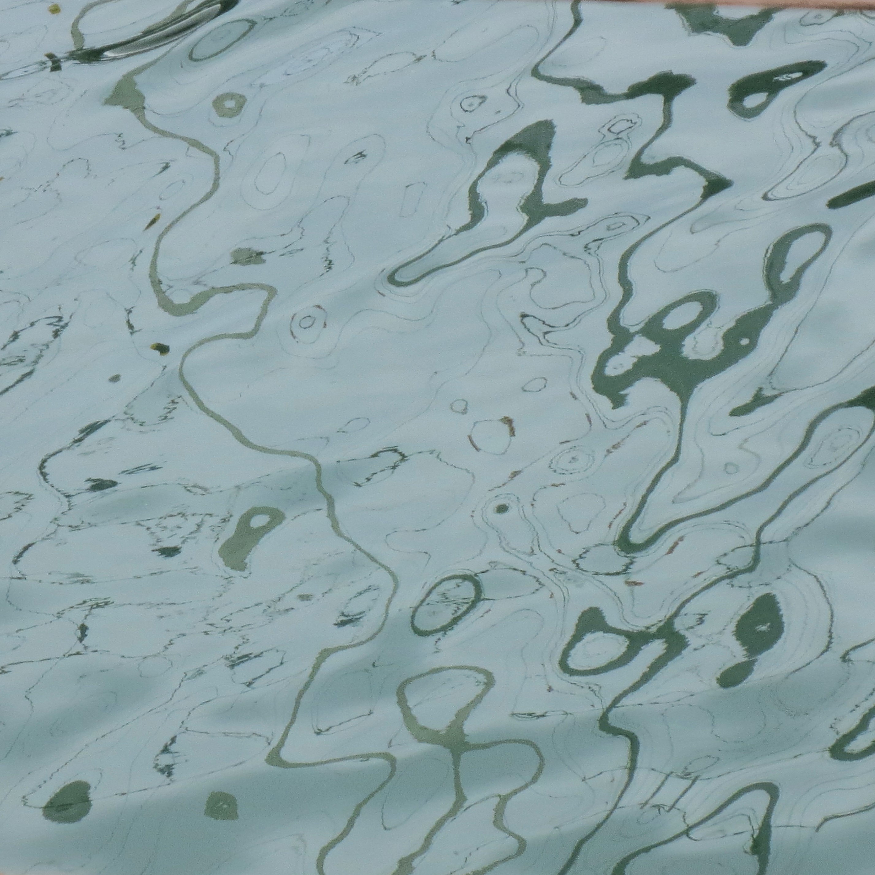
Whilst on the way to visit the Maritime Museum I was fascinated by the reflection patterns in the marina. The museum is absolutely wonderful and I would definitely recommend a visit.

We fitted in two castles and La Hougue Bie Museum too. The passage grave at La Hougue Bie is thought to be one of the ten oldest buildings in the world! It was lovely and cool to walk doubled over and crablike through the tunnel on what was a very hot day.


Sketchbook pages of water reflections in the marina ©2022LisaLeQuelenec


Marina reflections photograph ©2022LisaLeQuelenec


Unfortunately we came across this compass jellyfish left by the tide on one of our beach walks. Such a beautiful pattern of markings, I think I will be revisiting this page in the not too distant future.


Compass jellyfish and sketchbook pages   ©2022LisaLeQuelenec


As you can see someone else enjoyed her first visit too, especially the paddling and extra treats from Nanny and Grumpy.


So lots of new inspiration and ideas are now whizzing through head and waiting to emerge from my brushes.


Thursday, 29 November 2018

Winter walkies


Winter Walkies    watercolour on paper 40x40cm   ©2018LisaLeQuelenec


The winter walkies I have been experiencing haven't been quite as idyllic as this. Dark, dreary, soaking wet and blowing a gale have been more the order of the day this week but still a girl can dream.... It has made me very thankful for my waterproofs.

Ironically, in a way, water has been the essential element in painting these two pieces with very wet washes, glazing and minimal pigment. I have used a triad of Daniel Smith's sodalite, cobalt blue deep and yellow ochre light again. I love, love, love the granulations they produce and it has been good to work on a slightly larger scale again.


Both paintings are available in my Folksy store Seaside Studios UK.


One Man & His Dog   watercolour on paper 40x40cm   ©2018LisaLeQuelenec

Thursday, 8 November 2018

First to the sea


Looking for Treats (in progress)   17.5x17.5cm watercolour on paper   ©2018LisaLeQuelenec


First to the Sea   watercolour on paper 8x13cm   ©2018LisaLeQuelenec

Have you ever been to the beach really, really early in the morning before anyone else has arrived with a low tide and pristine virgin sand? You can be alone with your thoughts enjoying the breeze listening to your breath and the sound of your footsteps that dissipates into the big empty stillness as you are slowly warmed by the sun.


The colour chart from a few posts back is certainly coming in useful. Just a touch of colour in the mix and the atmosphere has changed.


These paintings are available at Seaside studios UK on etsy


Looking for Treats   17.5x17.5cm watercolour on paper   ©2018LisaLeQuelenec
 

Wednesday, 31 October 2018

Walking the dog II


The first two paintings for this mini series... once again I am in love with Daniel Smith's Sodalite Genuine and its gorgeous granulation's.


Walking the dog   watercolour on paper 17.5x17.5cm   ©2018LisaLeQuelenec


Walking the dog II   watercolour on paper 19.5x19.5cm   ©2018LisaLeQuelenec


Both paintings are available at Seasidestudiosuk on Etsy.

It might be time for a little colour. Where did I put my colour chart?


Thursday, 18 October 2018

Just walking the dog


Wet sand, reflections and silhouettes fill my mind and sketchbooks at the moment. They are inspiring a new mini project. I watched an interview on Youtube with Fred Cuming one of my all time favourite artists which is where the quote in my sketchbook has come from. He said;


'I might be the only person in miles of open space.
It provides me with endlessly fascinating problems
of conveying something which is about nothing
more than emptiness.'

Fred Cuming


You can see more of his work here.


Sketchbook page   watercolour and pencil   ©2018LisaLeQuelenec


He sums up so eloquently what I am trying to achieve. Light, space, solitude and quiet. I often think of my sea and sky paintings as 'the big empties' and this feels an extension of that work. Maybe the addition of a figure exaggerates that notion. Time to explore...


Sketchbook page   pencil on monoprint    ©LisaLeQuelenec


Thursday, 8 June 2017

Ocean's End


Ocean's End   acrylic on canvas 30x30cm   ©2017LisaLeQuelenec


The ocean, the sky and the light....

Thursday, 4 May 2017

Calm Waters I & II


calm waters Into the Blue ocean acrylic painting minimalist semi abstract coastal style beach decor by Lisa Le Quelenec
Calm Waters I   acrylic on canvas 24x30cm   ©2017Lisa Le Quelenec


ocean studies mixed media sketches postcards wave light sky by Lisa Le Qulenec ©2017
Postcard sketches for paintings 'Calm Waters I & II  ©2017LisaLeQuelenec

You might remember these two little postcards sized sketches that I posted last year. They have been patiently sitting on my pin board waiting to be given attention. I wanted to develop the idea of looking into the light and also of verticals in a seascape without reverting to motifs of landmass or sails etc. Another theme that seems to be developing in some of my work is an aspect of minimalism. How far can I take a subject and subtract detail without losing it's essence? I seem to go from one extreme to the other capturing small details of shells and feathers and the next the opposite where I am painting just tone and colour. It keeps things interesting...


all the blues colour palette inspiration grid coastal beach collection by lisa le quelenec ©2017
Colour inspirations photographs ©2017LisaLeQuelenec


I have to admit I am really enjoying using these strong blues again, it has been a while. Intermittent warmer days have arrived and the blues are making me feel that Summer may just be around the corner - or at least a warmer Spring.


calm waters Into the Blue ocean acrylic painting minimalist semi abstract coastal style beach decor by Lisa Le Quelenec
Calm Waters II   acrylic on canvas 24x30cm   ©2017Lisa Le Quelenec


Both paintings are available as prints in various formats and cards at Redbubble - Lisa Le Quelenec - click on the link.


Thursday, 27 April 2017

Submerged in the Sky - the moon and Neruda


Submerged in the Sky I  monoprint  ©2017Lisa Le Quelenec


I have been playing with some new ideas somewhat inspired by a translation of Neruda's 'Ode to the Moon', the idea of the moon being '...submerged in the sky.' is appealing as always its reflection on the ocean is a motif that seems to be constantly evolving in my work. I have been monoprinting and the process has taken over and so it developing and metamorphosing and blending with other strands and lose threads of work. I'm not sure where I am going with it but it is interesting none the less to let the process determine the direction.


Submerged in the Sky II  monoprint   ©2017LisaLeQuelenec


These are available as reproductions on Red Bubble or Fine Art America


Thursday, 16 June 2016

Mangata monoprints - exploring the theme


seasidestudiosblog.blogspot.com
Pause and Reflect   13x12cm  monoprint   ©2016LisaLeQuelenec


Three monoprint explorations on the mangata theme. They are experiments in technique as much as concept. There is something very meditative and calming about trying to capture this idea which I hope comes across in the images. After using paynes grey oil paint in the previous posts drypoint I treated myself to a new etching ink by Charbonnel in the same colour. This is what I have used in Mangata I & II below. It's a little bluer in colour but perfect for this subject I think.


seasidestudiosblog.blogspot.com
Mangata I   21x15cm monoprint   ©2016LisaLeQuelenec


seasidestudiosblog.blogspot.com
Mangata II   21x15cm monoprint   ©2016LisaLeQuelenec

Thursday, 2 June 2016

Jetty - a new etching


seasidestudiosblog.blogspot.com
Jetty   artist proof etching  7x15.5cm   ©2016LisaLeQuelenec


Browsing the internet one day I made a discovery, a word that I felt I had been searching for for a long time. I don't think there is a true alternative in English - if you know of one please let me know. It's the Swedish word MANGATA which according to the The Guardian translates as 'the road-like reflection of the moon on water'. What a wonderful word! One single word to describe a theme/motif that has run through my work on and off for a long time. I was very excited by the discovery that I had stumbled across by accident and it has sparked some new ideas. They need some time to develop but I think this etching might be the beginning.


seasidestudiosblog.blogspot.com
Sketchbook page ©2016LisaLeQuelenec

Etching proof with mixed media ©2016LisaLeQuelenec


Tuesday, 25 June 2013

Tranquil waters


Tranquil waters   watercolour 23x10cm   ©2013Lisa Le Quelenec

The result of paint left on my palette, a mix of paynes grey, ivory black, manganese blue and what ever else was left, one brush, a no.8 round and the end strip from a large sheet of paper that had been cut down. The inspiration came from an old sketchbook that I had been flipping through. I enjoyed painting with limited means, the challenge of making each element work hard. It was one of those off the cuff moments that just seemed to work. I thought it worked anyway..... 

Tuesday, 12 March 2013

River reflections - spring


Some small watercolour studies of the river from the last post. There are surprising amounts of violet in the waters shadows. Whilst the trees are still mostly bare, green buds are appearing and the colour is starting to fizz here and there.

Yesterday snowed most of the day though luckily it didn't stick. It was so fine and grainy that it looked almost like sand. Today is bright with sunshine although it does look quite chilly so there might not be much sketching done.


River reflections - Spring Watercolour A4 sketchbook

Tuesday, 5 March 2013

Getting out and about


I've been getting cabin fever, with the sun shining and birds calling I needed to get outside. I rushed through my chores, grabbed a camera and set off. It was a lot warmer than I thought it was going to be, so rather than going to the beach I headed for the river to find the evidence of Spring. Today wasn't about painting or sketching so much, more of a reconnaissance for future work and a recharging the batteries so I didn't do any sketching just took a few snaps as reminders of where to revisit.  I'm always drawn to the river reflections, there may be a series of drawings based on them in the not too distance future.


Snap shots from my walk photograph medley ©2013Lisa Le Quelenec


I had to include this snap of the black headed gulls. They line up along the bridge waiting for the people who come to feed the ducks. As you walk towards them they size you up for any goodies they might want then as you get too close one by one they drop of the side. They make me think of synchronised swimmers diving into the pool.

Tuesday, 11 September 2012

As Venice sleeps

As Venice Sleeps   acrylic on paper 17x27cm ©2012 Lisa Le Quelenec
I had forgotten, I hadn't posted this painting that was completed just before my visitors arrived. This was the last painting that I will do of Venice for a while. Duty calls and I am returning to the beach as exhibitions are fast approaching. I really enjoyed the change of location even if the themes running through are similar. I always shy away from buildings and architecture so it was a challenge for me to find a way of representing them without going into too much detail. Do you think it works?

Wednesday, 1 August 2012

Waiting II

Waiting II acrylic on paper 16x26cm ©2012 Lisa Le Quelenec


I finished the partner to my previous posts painting over the weekend. Both are now double mounted in a textured white board and available in my Etsy gallery  here .  In the coming months I think there will be more Venetian paintings. I see these as a continuation of the themes in my work - light on water, spatial and quiet contemplative depth - just maybe a new arm.


An artist whose work I admire who often talks of working from memory is Loriann Signori. Her latest post here on working in a series very eloquently and succinctly describes the power of producing a body of work in this way. You can see very clearly from her new  website  the themes and relationships running through her work.


Thursday, 26 July 2012

Waiting

Waiting   acrylic on paper 16x26cm ©2012 Lisa Le Quelenec
This seems a very apt title for this painting. Let me explain.... I visited Venice for five days in 2008. I'd wanted to go for years and was so excited that I spent weeks putting together a sketching kit whittling it down to the essentials then adding more in to the pack then whittling it down again. I bought a new memory card for my camera just in case I ran out of room on the one I had. I had a new sketchbook, new paint, I was so excited counting down the days.

Once there it was everything and more than I expected. In fact it was so 'more' than I expected that I was completely overwhelmed and visually overloaded. I managed a few very poor sketches and took a few hundred photos and did very little else other than trying to absorb as much of what I was seeing as I could. As a holiday it was amazing and I would recommend to everyone to take the time to visit. I would love to visit again and am sure that one day I will. 

At home I tried and tried to paint the Venice that I had seen but in hindsight it was just too fresh in my memory. Whatever I tried came out too literal and didn't express any of the thoughts, feelings or experience. They didn't cut the muster as paintings for me and I felt very frustrated. With a subject that has been painted so many times by so many artists it is difficult sometimes to to paint without emulating someone elses vision resulting in a poor pastiche.

It has been just lately that I feel like I can paint the Venice that I felt and my over riding visual memory of the place; the evening walks, the hustle and bustle slowing down for the day and the softening of the colours and edges of the silhouettes of buildings, bridges and gondolas. The distance of time has filtered out the visual clutter and white noise distilling and refining the experience. It's the distillation that seems to become more and more important to my work.


Monday, 9 July 2012

Riding along the shore WIP part 1


I selected a piece of board 20x50cm for this painting, not too big and not too small, the ratio feels 'right' for the sense of space that I want to portray. (There is no reason in particular for this size it just feels instinctively right and is proportionate to some of the preparation sketches that I had done.)

I began the under painting on a warm neutral ground and very loosely blocked in the main shapes of sky, sea and sand. The second stage in this painting was about setting my darkest tone in. I did this early on using ivory black in the dark masses of the water. I knew I wouldn't end up seeing the black after the layers of blue were painted on top  but they would quickly give the depth of the shadow that I wanted in this area.

Now the darks were in place I could easily judge how light the lights needed to be. More often I paint the other way around and put my lighter ranges in first but the painting was willing me to work in reverse. I thought I would go with it and let the painting dictate the way it wanted to be painted.

By the end of stage 3 you can see pretty much all of the black has been painted over. (As a side note ivory black mixed with buff titanium is a very useful colour for sand shadow in evening light. - you can see my old fear of tube black has pretty much disappeared over the last year. ;o) ) As usual I have used a number of blues; coeruleum, cobalt, ultramarine (a blue that I very rarely use) and indigo.


Saturday, 7 July 2012

Riding along the shore - sketchbook preparation for a painting


I thought I'd share a work in progress as it has been a while since the last one. In the past I have shown a stage by stage progression of the actual painting starting with the under painting and working my way through to the final stage. This time I thought I would show the progression from initial concept.

This piece started back at Christmas, on Boxing Day to be exact, with a walk on the beach at St. Aubin's Bay in Jersey. When I was a child we lived very close but in the last twenty years it has become almost unrecogniseable when you look toward the town side as much land has been reclaimed from the sea and the harbor extended.

The photograph makes it look like a really dull and grey day but it was a beautiful morning and warm, it didn't feel like December. The bright sun reflected in the wet sand has over exposed the photo making it look very dark in comparison to how it was. There was hardly anyone on the beach at all, it felt like His Nibbs and I had the whole bay to ourselves. As we walked halfway around the bay a rider was exercising her horse at the waters edge and the reflections they made in the wet sand were catching my eye. On a large expanse of beach even a large horse can look miniscule.  I took some photos and watched intently trying to memorise what I was seeing as I had come out without a sketchbook.....


Sketchbook studies ©2012 Lisa Le Quelenec


It was the sense of scale in particular that I wanted to explore and after sketching square format compositions I thought I would try out a couple of panoramic shapes. It was this format that I decided to focus my attentions on.

You can see that very early on in these planning stages that I have decided to leave out any reference to the actual place. I could have included the shapes of the land or St. Aubin's Fort in the right of the bay or Elizabeth Castle on the right. The reason for this is that by omitting it the painting becomes at once more universal, it could be any beach and the rider could be anyone. I hope for the viewer to be able to put themselves in my paintings with their own memories and experiences.

I practiced getting the shape of the horse and rider, who I planned on showing only in silhouette, first in pencil, paying particular attention to the negative shapes made by the horses legs. (The photographs that I had taken came in very handy here.) Once I felt a little more confident I tried just drawing them with a brush in as few strokes as possible and to the scale that I would need in the painting.

The collage of images above is made from tiny sketches that were originally just a few inches big. Each time a new thumbnail is drawn, the plan for the painting develops, sometimes there are blind alleys but on the whole it is a very useful process for me in developing the essence of a piece. Better to adjust an element in a small thumbnail than to have to adjust something crucial in a large canvas. With preparation done it is time to get on with the painting....

Monday, 5 September 2011

A challenging watercolour tangent

I had planned to post about some preliminary work that I've been doing the past few days for my next big painting but whilst doing some experimenting I got distracted and wandered off on a tangent. The following watercolours are the result.....


Gathering clouds
watercolour 11x15cm
©2011 Lisa Le Quelenec
Silver night
watercolour 21x21cm
©2011 Lisa Le Quelenec

I used lamp black, indigo and ultramarine violet with gouache in the clouds. The paper is khadi a beautiful paper handmade in India. I really like the deckle edges and the textured weave of the surface which encourages the pigments to granulate. Exploiting the texture and using an almost dry brush, holding it horizontal to the paper surface I could get the sparkles of the water in the painting on the left.

I enjoyed the tangent but ohhhh watercolours are HARD!  I'd completely forgotten just how much lighter the washes dry when trying to get a good dark. I used sooo much pigment and then wondered why I just hadn't stuck to acrylic.... makes me appreciate once again just how talented watercolourists are.

This link takes you to one of my favourite ever watercolour books, I totally agree with the first reviewer of the book when they say of other watercolourists that, '....it may make them weep and grind their teeth at their own inadequacy.' For me Sargent is a master watercolourist being able to say so much in such beautiful expressive strokes. I visited the 'Sargent and the Sea' exhibition at the Royal Academy last year and one of the highlights for me was to be able to get so close to some watercolours he'd done in Venice. They took my breath away, the light and colour were just unbelievable. Can you tell he's one of my heroes?

Wednesday, 1 June 2011

Mixing it up a bit

 
This is another experiment using monoprints, on the left I'd added watercolour which resisted the ink of the monoprint. There wasn't very much bare paper in the top area so really the change was nominal. My intention was to slightly refine the drawing and beef up the colour in some areas whilst still keeping lots of the mark making of the print.

On the right is a picture of the same piece with added colour pencil (Derwent). This toned down some clumsy areas where the ink had been too thick but flattened out the light in the tops of the reeds.


To gain back light and get in even more colour I worked back in with pastel. Believe it or not there is still quite a bit of the original monoprint visible. I've added a detail of the painting which shows the amount of colour more truly, the photo of the whole has flattened it somewhat.