Thursday 28 October 2010

A new beginning

A New Beginning
30x60cm acrylic on canvas
©2010 Lisa Le Quelenec

So here we have it, all finished. It almost seemed to paint itself in the end, as usual it was a case of darkening the darks and lightening the lights. Whilst I've been painting the cloud series I've been constantly reminded of a school teacher and very accomplished artist that I had way back. He always said that you can't have light without dark and if you want to show the brightest blinding light then you must also have the darkest dark right next to it. I learnt so much from him. He was very fond of the quote, I think it was Klee but I could be wrong, 'Step into the void'. I feel like I've done a lot of that this year.

Wednesday 27 October 2010

In the sky and over the sea...


This is what I have been working on the last couple of days, I think I'm just over the halfway mark. I want to expand on the theme of being amongst the clouds. As always my main concern is the light. (Isn't that what we are always chasing as painters?) I am enjoying the idea of having different perspectives within the same piece - a sense of looking both upwards and down at the same time. How does it read to you?

Tuesday 26 October 2010

Sketching at the river


A sketchbook page from the weekend at the river. I think reflections could become a new obsession. (Like I need another one!)

Monday 25 October 2010

An autumnal evening


Autumnal Evening
26x26cm acrylic on paper
© 2010 Lisa Le Quelenec

A change of direction in more ways than one. Instead of walking at the beach this weekend I literally had a change of direction and went for a walk by the river instead. I'm really glad I did. The last time I went there was way back in the summer and after the first frosts this week that seems like quite a while ago. Everywhere I looked there were paintings crying out to be painted, I think this could be a new project. (Why do I get these ideas as the weather gets colder and wetter?)

The above is my first painting inspired by that walk. It was really nice to have a change of palette and I enjoyed painting the teasels. I've included a couple of close up shots so that you can see more of the mark making that I've used. Sometimes it's hard to tell when you see the whole picture but I use a lot of scumbling and dry brush techniques as well as glazing colour. Way back when, on my foundation course we spent a whole term just exploring mark making and it was a whole lot of fun. I think I would like to explore this more again and a new project would be the perfect opportunity. With a series about the river there would be a whole new world of reflections and slower moving water to explore and also a new vocabulary to learn.


Tuesday 19 October 2010

Fading light


acrylic on paper 14x9.5cm

acrylic on paper 14x9.5cm

Please may I have your help....out of the two sketches above which one do you think shows the biggest space? Do the clouds on their own in the top show a bigger depth or is it the addition of headland in the bottom one that helps? Both are painted as if you are standing on the clifftop with no foreground to give a visual clue. Do you prefer one over another? As always, if you have a spare minute to drop me a line in comments I'd really appreciate your input.

I'm experimenting with the illusion of depth again, in the bottom one the headland gives a deeper sense of perspective to me but the cloud feels so much closer and so more claustrophobic. I like the idea of painting as if the viewer is there in the sky but I'm not sure if this contrast is reading right.

Monday 18 October 2010

Wild weather and raging seas

Wild Weather, Raging Seas
15.5x15.5 acrylic on paper

Just thought today that I haven't mentioned what kind of paper I work on, for those that are interested my favourite is 300lb hot press arches. It feels like a substantial card and is about half as thick as a mountboard. I love to have a heavy weight paper so that it can stand up to the, sometimes torturous, applications of paint, (I have been known to take sandpaper to a painting to expose layers of underpainting). The heavy weight means I don't have to stretch it or worry that it will buckle, even with thick layers of paint or medium.

Sunday 17 October 2010

Poppy pages

I love poppy seed heads for their colour, shape and structure. Here are a couple of pages from my sketchbook just showing you some of the drawing practise that I do and some playing around - mostly these things are just for my own amusement although every now and then I do a finished painting.


On these pages I printed out some photos I'd taken and played around with on the editing program on my lap top. You can see the notes I made to myself, I often have conversations with myself to fire my imagination or give me ideas in my sketchbooks as I know I will look back on them later. I find it really useful to make colour notes and techniques for individual paintings.

I've got lots of sketchbook pages like these, some will never see the light of day again, others will be picked up maybe years later and played with again. Sometimes a whole body of work can come from a few pages of play from years before. I'm definitely the kind of painter that can mull an idea over a long period of time.


Quick sketches for compositions that I might try out at some point in the future. These few pages were an afternoon that I let myself have off to play, I hope it gives some indication of working methods that I use and that you've enjoyed a peek in my sketchbook. In case you have missed my post the other day I've updated my flickr account to show lots more sketchbook pages if you would like to see.


Thursday 14 October 2010

Nosing through sketchbooks

I love nosing through other peoples sketchbooks, if you would like to have a gander through my sketchbooks, past and present I've updated my flickr account to include some pages. Click on the link to the right on the sidebar.

Towards Hengistbury Head

12.5x8.5cm watercolour and gouache

I'm really trying to paint in landscape format but I can't help seeing this working as a square.

Wednesday 13 October 2010

Changing scale


12.5x8.5 watercolour and gouache

Yesterday Jazz Green asked in comments why I would want to work on a smaller scale (thank you for stopping by and giving me feedback on these,) and I thought I would reply in a post. I do normally work in a variety of sizes and I do love to work on large scale pieces but there is something that appeals to me about trying to portray something as huge and magical as a thunderstorm on a small scale whilst still retaining the sense of power. My aim with these small pieces is for the viewer to feel the wind, rain and noise (or lack of it in the seconds before the storm breaks). With a smaller scale I hope the intimacy created between the viewer and the painting makes a connection to their own experiences.

It's also a bit of a challenge, how small a format can I work in before the sense of scale that I want to show is lost? Another challenge.... how to achieve a sense of the depth of field without the use of motifs like yachts or headland to put the scale in context? This is what I am exploring at the moment.

Something I am finding is that although the size is smaller, I work on these more intensely.

Tuesday 12 October 2010

Continuing storms


12.5x8.5cm watercolour and gouache

The latest in my storm series and I'm challenging myself to paint to smaller and smaller formats.

Monday 11 October 2010

Racing the Storm


Racing the Storm
16x16cm acrylic on paper

Lots of painting being done and lots of ideas are flowing. The weather here is beautiful, hot and sunny, unusual for this time of year, made more strange by the fact that I'm painting stormy weather. Paint is drying quicker than I can get it on the canvas and I'm itching to get outside and make the most of it but there are a lot of deadlines looming and a lot of work to be done.


Friday 8 October 2010

A taste of Cornwall in old sketches

 A comment from Vivien at Painting, Prints & Stuff got me thinking today about Cornwall. I did a foundation course there and it was such an inspiring place to be. I've been digging out old sketchbooks and looking at an old painting.

The two on either side are of St. Michael's mount and were probably done about eight years ago. I distinctly remember being pestered by what felt like hundreds of sand flies whilst I attempted to sketch. (It's my dodgy photographic skills today though that have made the horizons so wonky.)


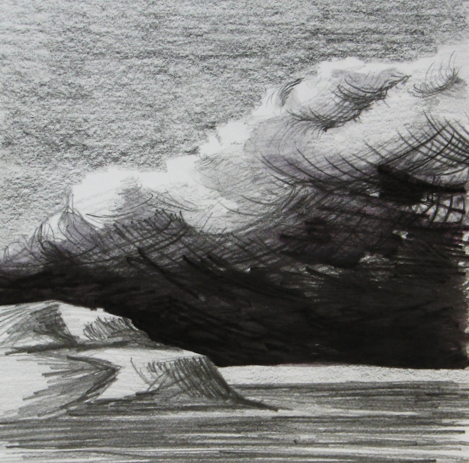
 These are of Wheal Coates Mine, done two or three years later. You can see from the one on the left I was quite influenced by Michael Morgan at the time. Strange how even with the passage of time the colours I used were the same as the St. Michael's Mount sketch. The colours I used were much bolder and brighter back then and I also used a lot of texture pastes. I used to scan sketches and play with the colours in photoshop, reversing them and changing hues and saturations and then use that as a guide for my painting. That's something I haven't done for a long time but maybe I should as an experiment.....


In the painting Copper Gleam I've upped the contrast in the photo so that you can see the texture paste I used in the cliffs. The sky in the painting isn't quite as light as it appears here. This is one of about four paintings that I have left from my Cornish work, for me it's a keeper as it reminds me of good times. I've not been down to Cornwall the last couple of years but I really hope to next year.

Looking at these old sketchbooks has sparked so many ideas for new work and themes to perhaps revisit. At the moment I'm seeing lino prints in a lot of these sketches. I find it interesting to see as well just how much my work has changed but also how similar it is. So a big thank you to Vivien for the nudge.
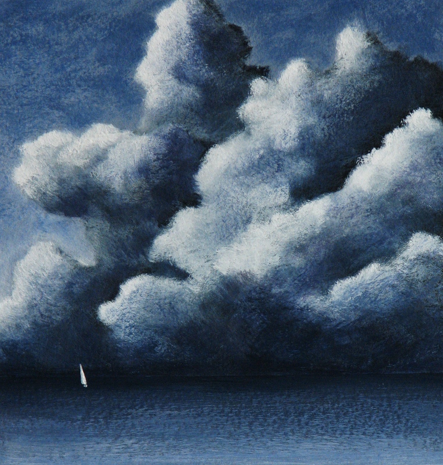
 Copper Gleam
12.5x17.5cm acrylic on board

Thursday 7 October 2010

A storm is brewing


Sketches in pencil, ink and white acrylic.

I've got the seed of an idea that has been planted in my mind for a while and I thought I'd post some sketches. The headland is Hengistbury Head and is popular with locals and tourists alike. I love sketching there. From the top of the headland there is the 'sea' side with views to the Needles and Isle of Wight stretching way across to the Purbecks and Swanage, or the other side towards Mudeford and Highcliffe and if you turn inland there is the view across Christchurch and the river. 360 degrees of painting material - perfect.

Wednesday 6 October 2010

Perfect weather for clouds....


Today the weather has been perfect for cloud sketching, very sunny with a brisk breeze so lots of changing cloud forms to sketch. I've spent most of the day sketching and when I wasn't I've been obsessively keeping my eye on the windows to capture the shapes and tones in my memory.

Saturday 2 October 2010

Watercolour skies

Towards Swanage from Southbourne


I thought I'd try some sky sketches in watercolour and gouache. I think I'll stick to pastels next time I go sketching sky. My clouds look way too heavy, like they would crash out of the sky, and I really misjudged the tones. Areas have dried way too dark and whilst some of the dark could be lifted out I think I will keep them this way as a reminder of what not to do. I am enjoying the speed that I'm working at to capture fleeting moments in the light but watercolour is taking too long to dry in the damp weather, still it was a good challenge.